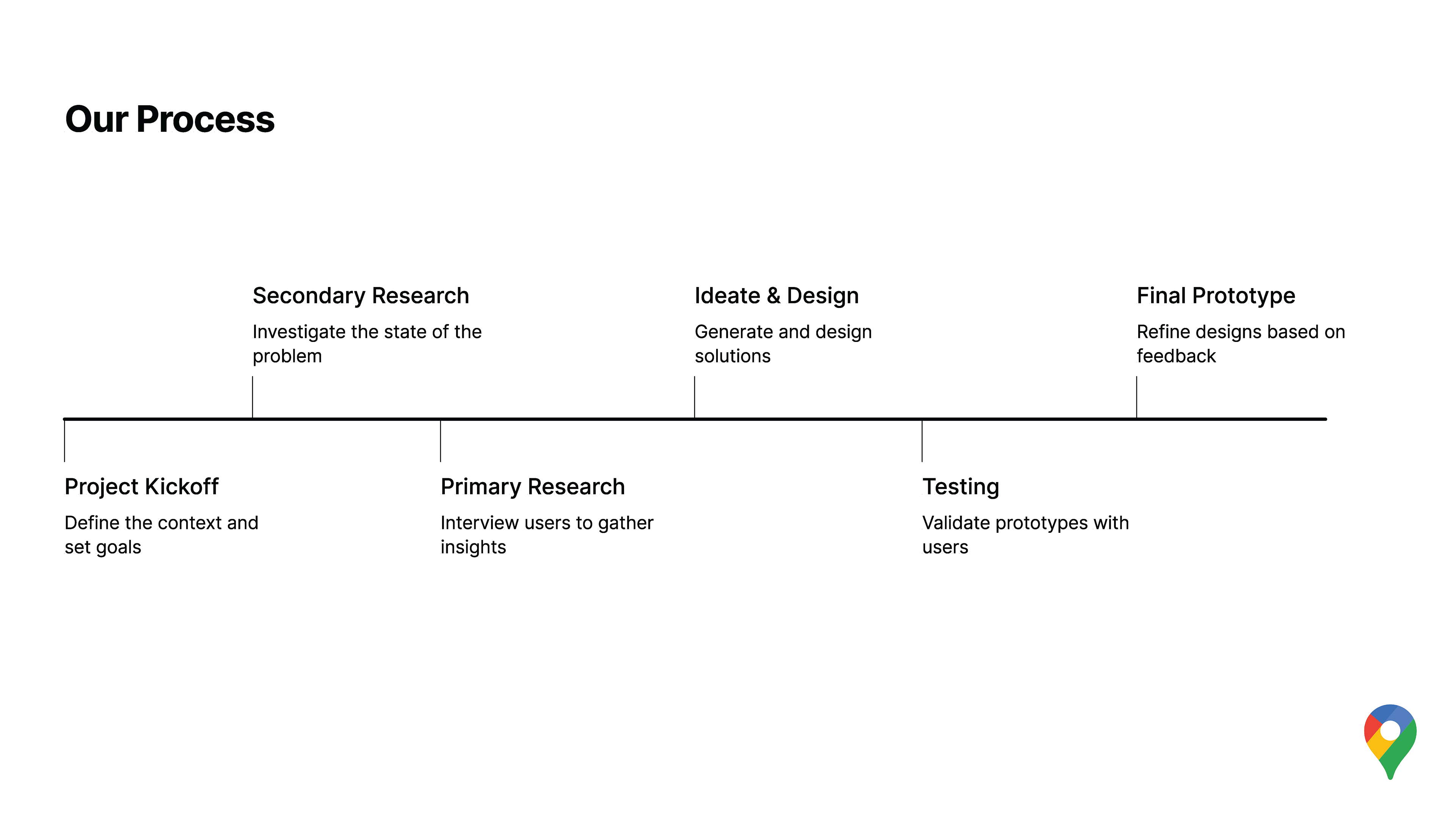
Role: UX Researcher & Designer | Team: Bowen He, Cindy Tan, Atiya Haque | Duration: 3 Months
Methods: Screener Survey, User Interviews, Contextual Inquiry, Usability Testing, Journey Mapping, Prototyping
Tools: Figma, Qualtrics, Notion, Google Sheets
Q: Have you ever been lost taking the subway in NYC?
Description
A completed UX research and design project that moved from user research and synthesis through ideation, prototyping, and usability testing. The final outcome is a validated concept exploring how Google Maps could better support in-station wayfinding, real-time clarity, and peer knowledge within the NYC subway system.
Overview
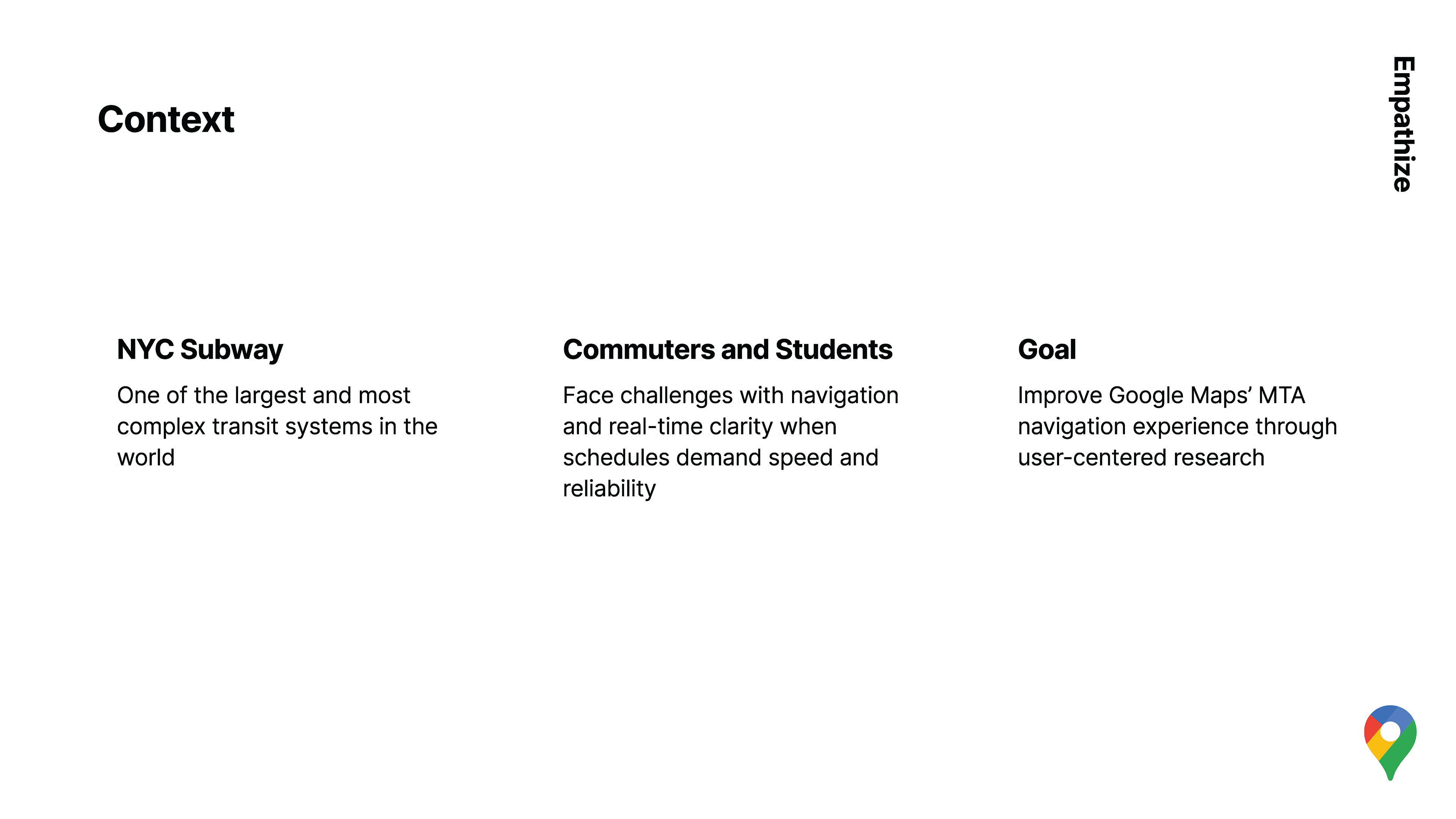
New York City’s subway system is one of the largest and most complex transit networks in the world, serving 3.4 million daily riders across 36 lines and 472 stations. While Google Maps excels at route planning, riders often struggle inside stations—where signage is inconsistent, real-time updates are unclear, and confidence drops during transfers and delays.
This project investigates how MTA riders—both experienced and inexperienced—navigate and make decisions underground, with the goal of identifying opportunities for better support in in-station navigation, real-time clarity, and community-driven knowledge through thoughtful digital–physical wayfinding integration.
The Problem
Navigating the NYC subway is a fragmented experience.
— Riders frequently get lost transitioning between street → mezzanine → platform
— Signage inside stations often does not match app directions
— Real-time updates are unreliable or poorly contextualized once riders are already in motion
These gaps force riders to constantly cross-check multiple sources, increasing cognitive load and anxiety—especially during delays or service changes.
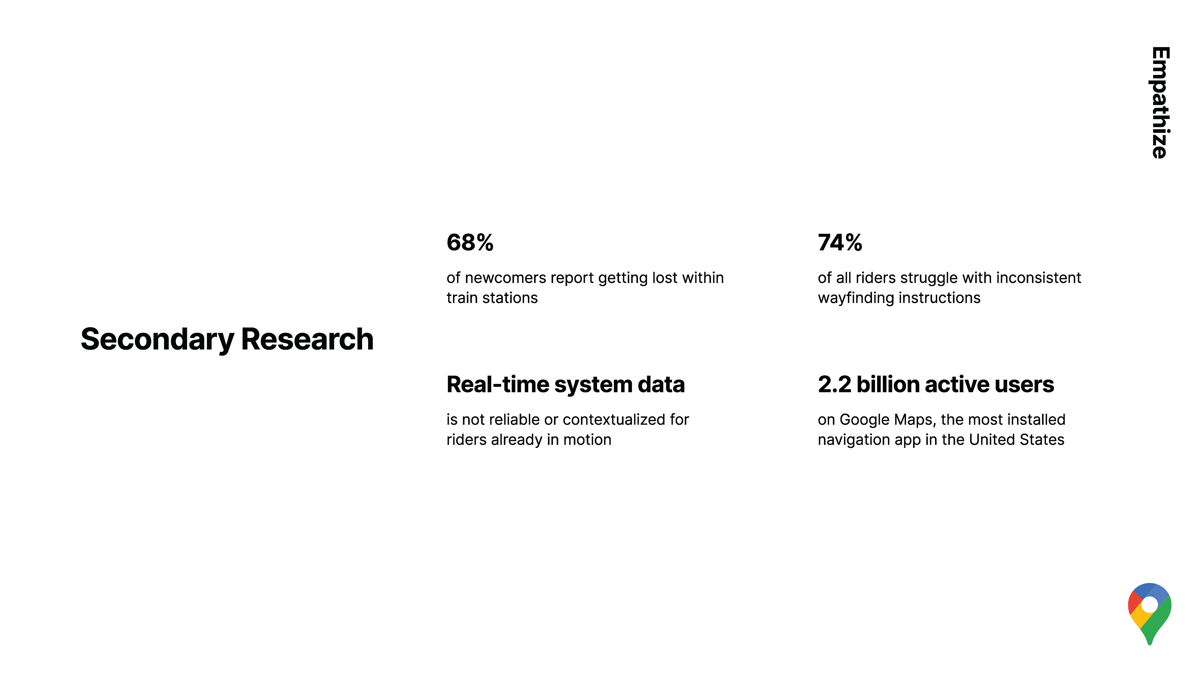
Key Secondary Research Insights
68% of newcomers report getting lost inside stations
74% of riders struggle with inconsistent wayfinding
Riders already in motion lack contextual real-time data
Google Maps serves 2.2B+ active users, making it a powerful intervention point
With these insights we moved on to primary research
Primary Research Questions
1. How do new MTA riders and experienced riders differ in their navigation strategies and confidence levels?
2. What environmental or cognitive factors contribute to disorientation underground?
3. How effective are existing digital tools for intra-station guidance?
4 .How do accessibility needs and language proficiency affect comprehension and trust in navigation information?
5. What design opportunities can bridge digital wayfinding and the physical transit environment?
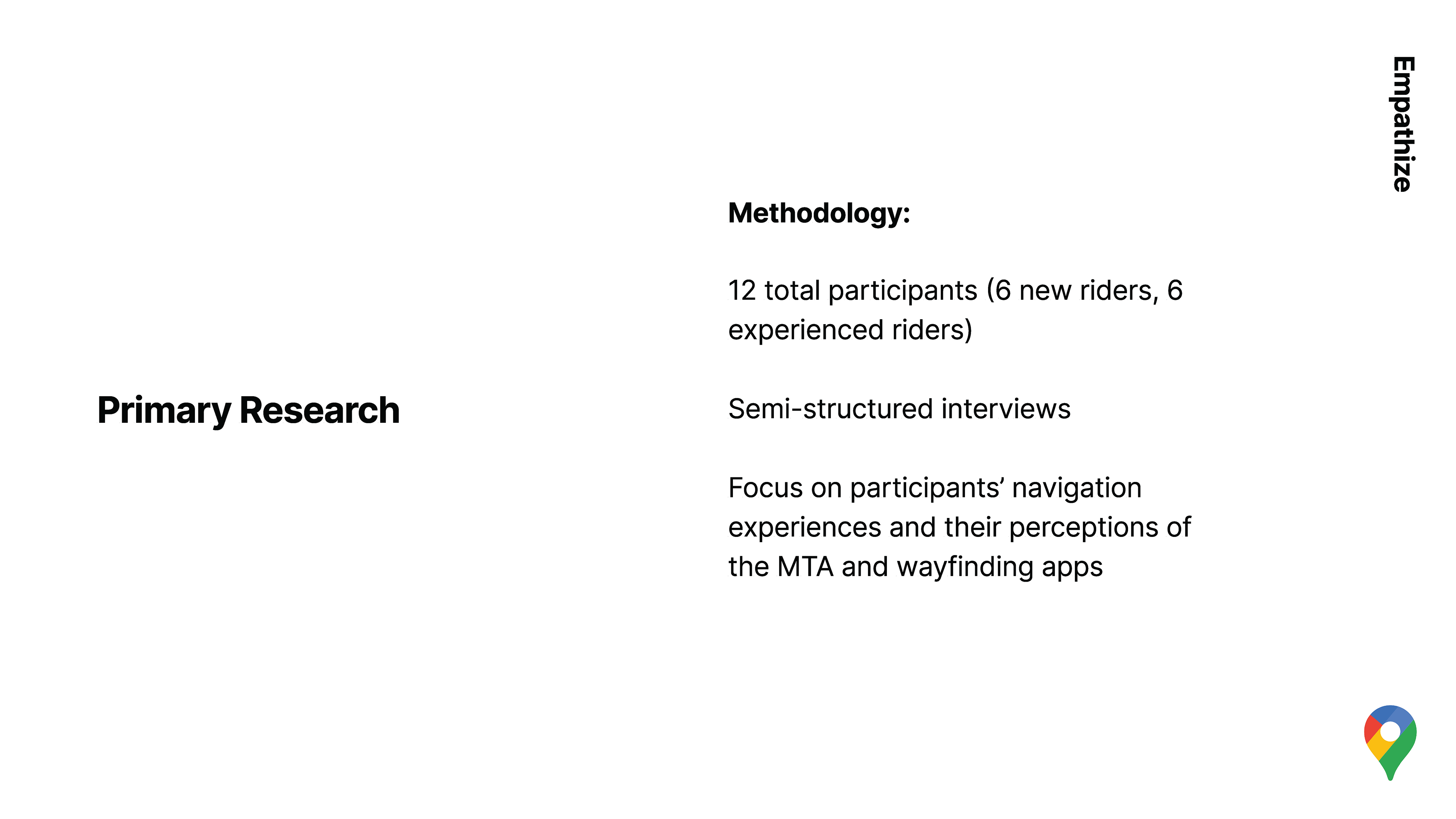
Methodology
Phase 1 — Screener Survey (Quantitative)
Objective: Identify participants based on subway familiarity, navigation confidence, and language preference.
Sample: 30–40 responses → 12–15 selected.
Outcome: Two user segments emerged:
— New MTA Riders – first-time or infrequent users, often tourists, students, or recent residents.
— Experienced MTA Riders – daily commuters familiar with multiple lines and transfers.
Phase 2 — In-Person Interviews (Qualitative)
Locations: Times Square, Fulton Center, Canal Street, Union Square
Duration: 30–45 minutes
Themes:
— Journey confidence and first-impression stressors
— Signage clarity and transfer difficulty
— Digital vs. physical map reliance
— Accessibility gaps and trust in information sources
Phase 3 — Usability Testing (Behavioral Observation)
Task: “Use your preferred app to navigate from Times Square–42 St to Canal St.”
Metrics:
— Time to complete route
— Number of route corrections or missteps
— Verbalized confusion/frustration
— Post-task stress & clarity ratings
Participants
New MTA Riders: Tourists, students, or residents new to the subway system — 6
Experienced MTA Riders: Long-term NYC commuters familiar with multiple lines — 6
Diversity Considerations:
— 20% non-native English speakers
— Balanced mix of age (18–55+), gender, and cultural background
Recruitment
— QR flyers at subway entrances (Times Square, NYU Tandon, Canal Street)
— NYU student and commuter communities, and expat groups
We've gathered a wealth of data from our primary research, and distilled to these key insights that are actionable within our current scope.
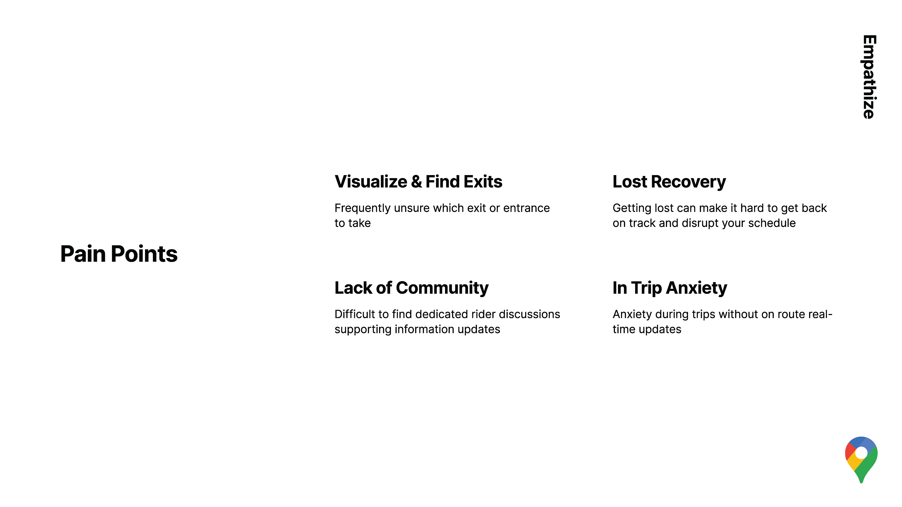
Key Primary Research Insights
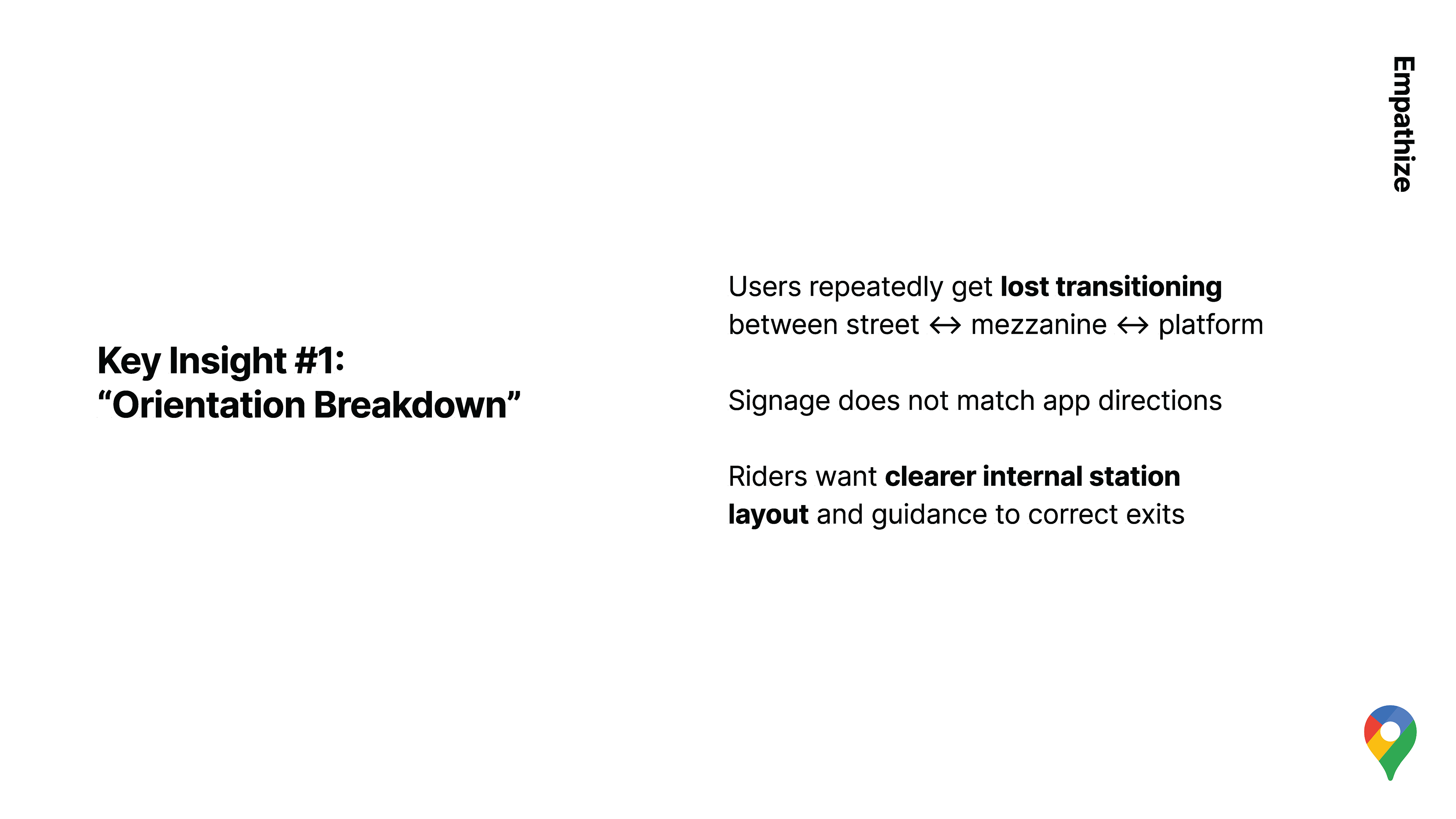
#1
Riders repeatedly get lost when moving between station levels. They want clearer internal layouts and guidance to the correct exits—not just any exit.
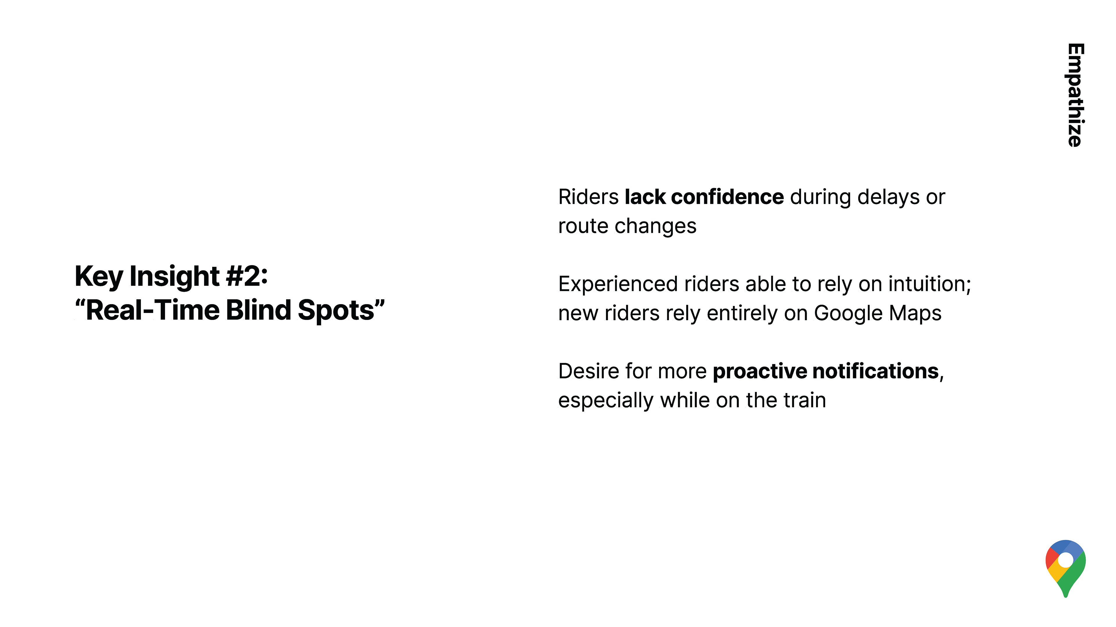
#2
During delays or reroutes, confidence drops sharply. Experienced riders rely on intuition; new riders rely entirely on Google Maps—yet updates often arrive too late or lack context.
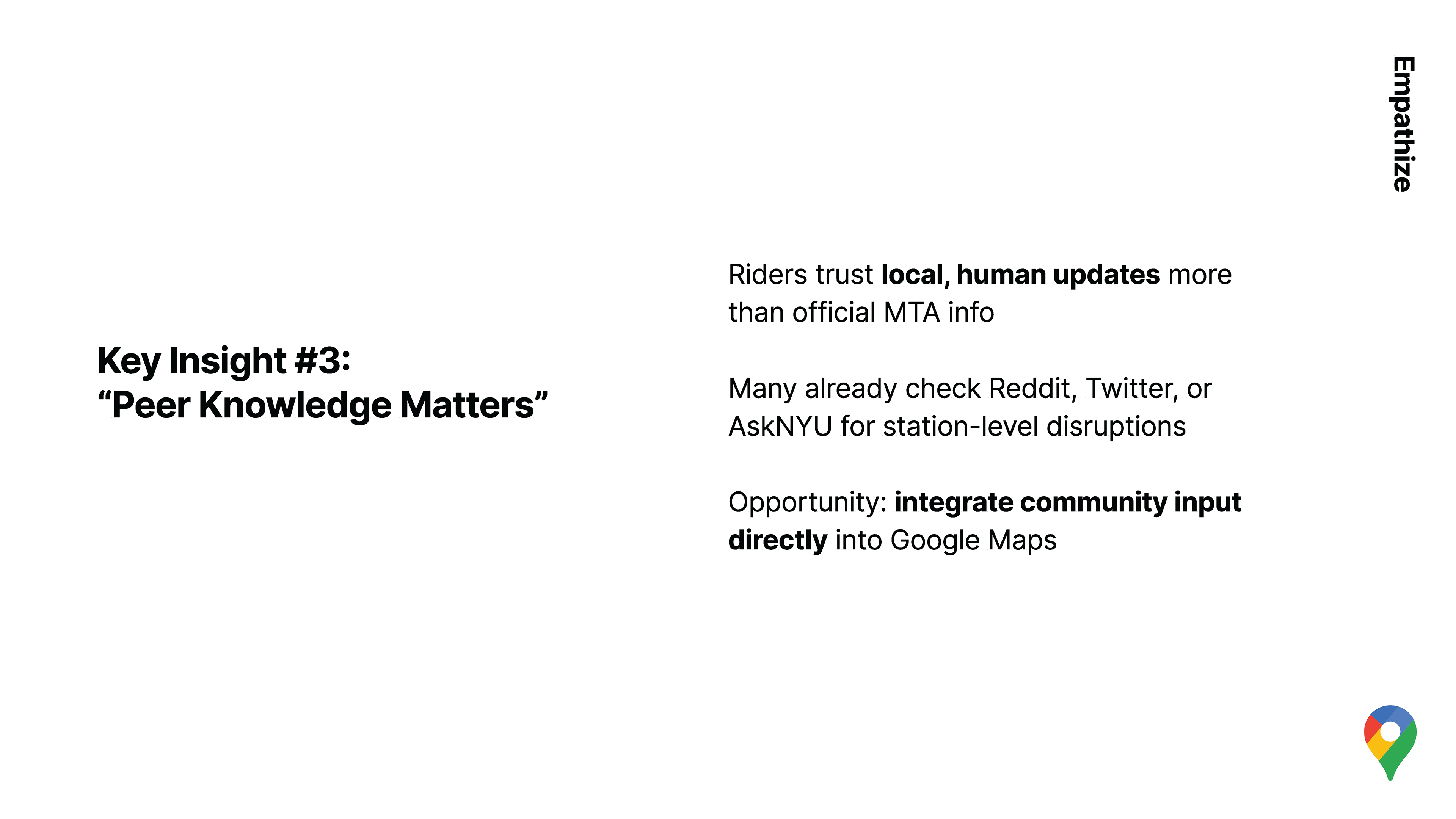
#3
Riders trust local, human updates more than official MTA information. Many already check Reddit, Twitter, or AskNYU for station-specific disruptions.
Additional Insights
New Riders: Depend heavily on apps, often double-check information with others when service drops; high anxiety in multi-line transfers.
Experienced Riders: Rely on spatial memory and visual cues; frustration arises mainly from unclear or outdated service-change signage.
Shared Pain Points: Poor exit clarity, inconsistent wayfinding logic between stations, and cognitive overload from conflicting information sources.
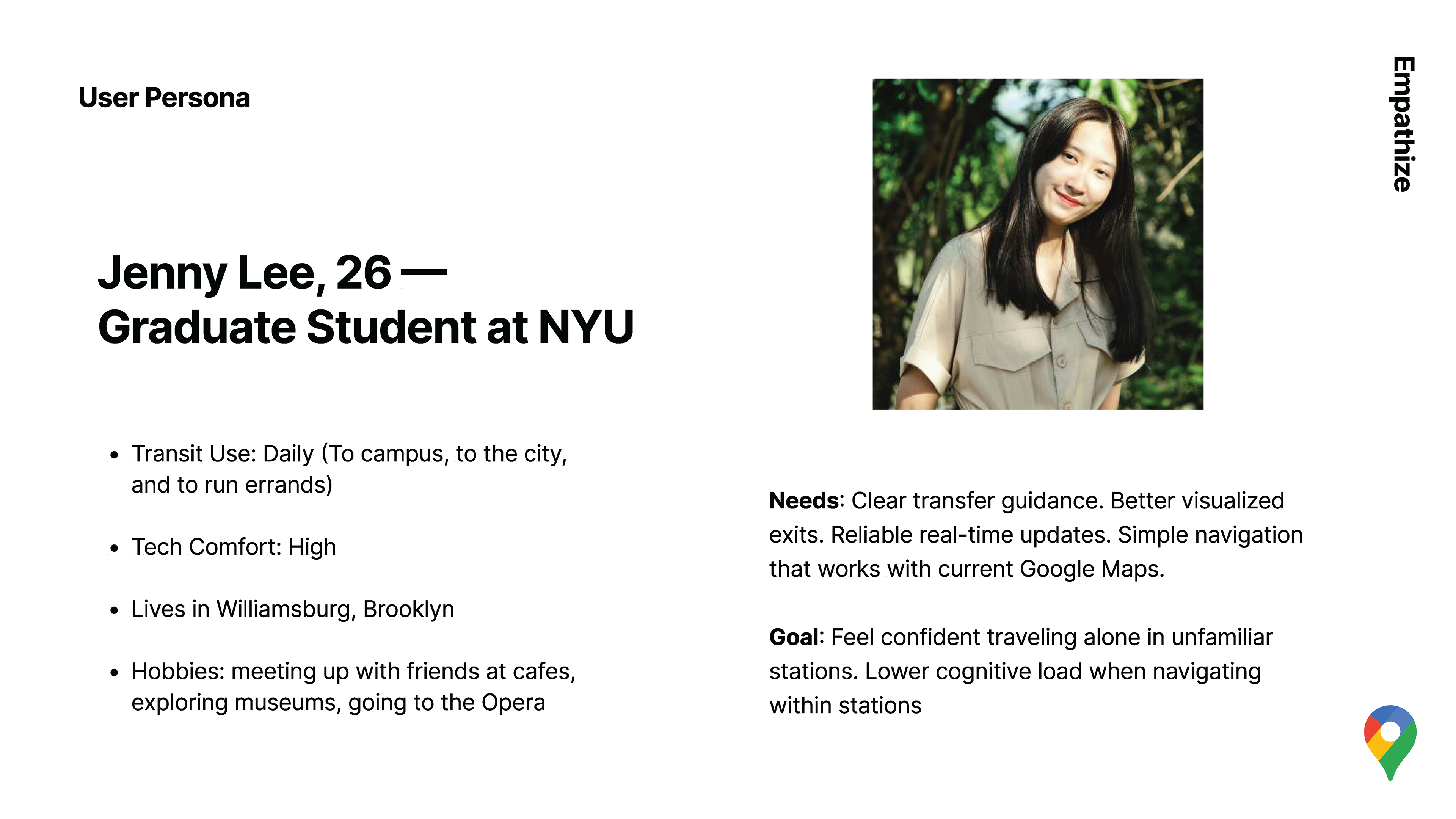
And with these insights, we created a User Persona, here Jenny is a fellow graduate student as most of our research participants were more mature NYU students. We defined Jenny's pain points, updated our problem statement, and came up with actionable design directions for the next phase of the project.

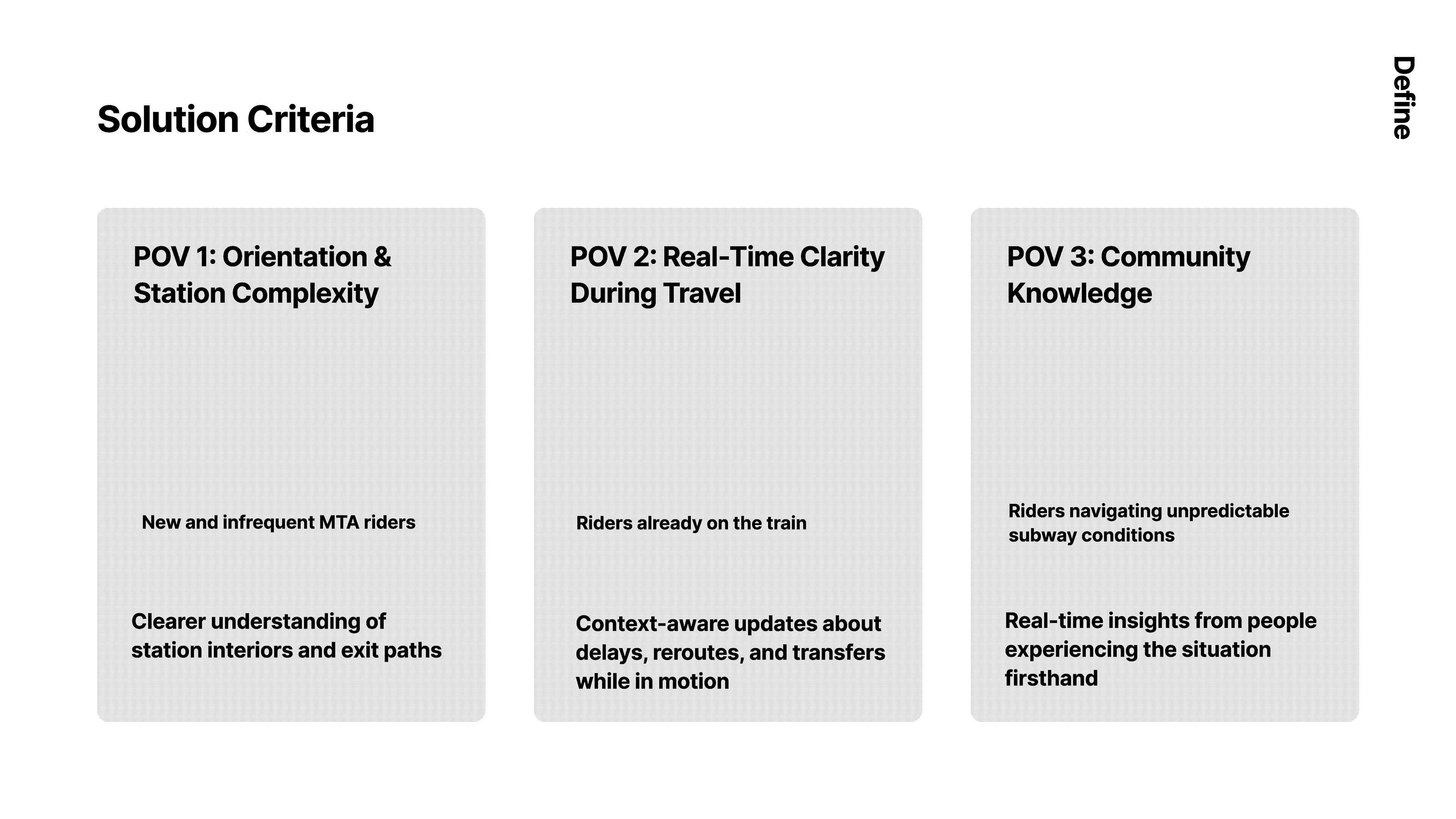
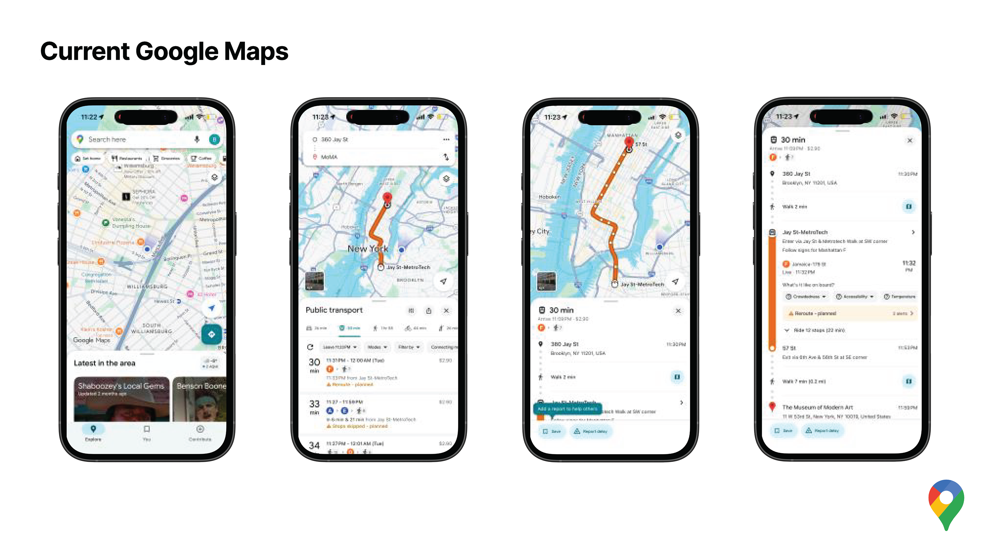
Our secondary as well as primary research tells us that Google Maps is the most used application, making it an ideal intervention point.
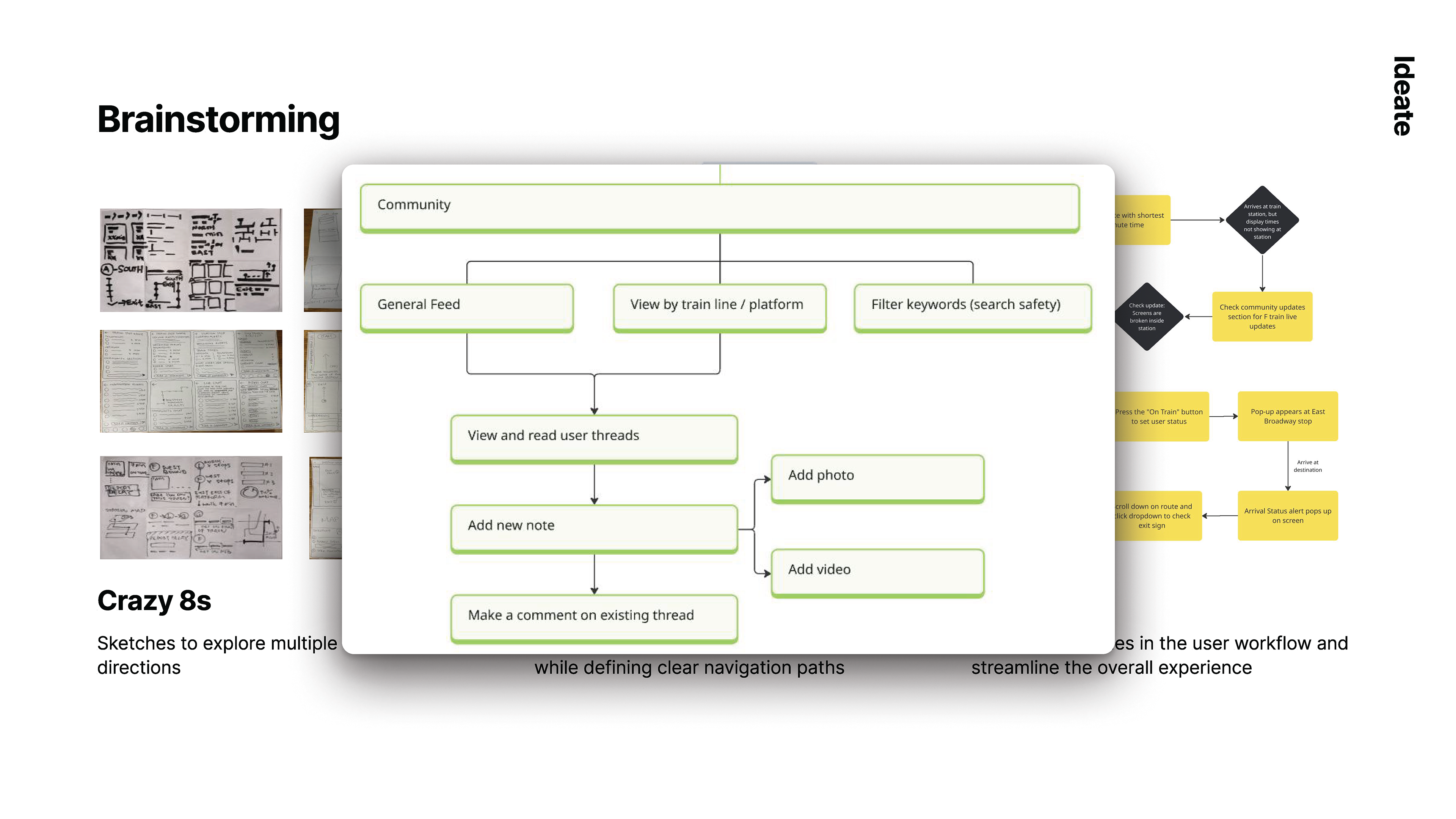
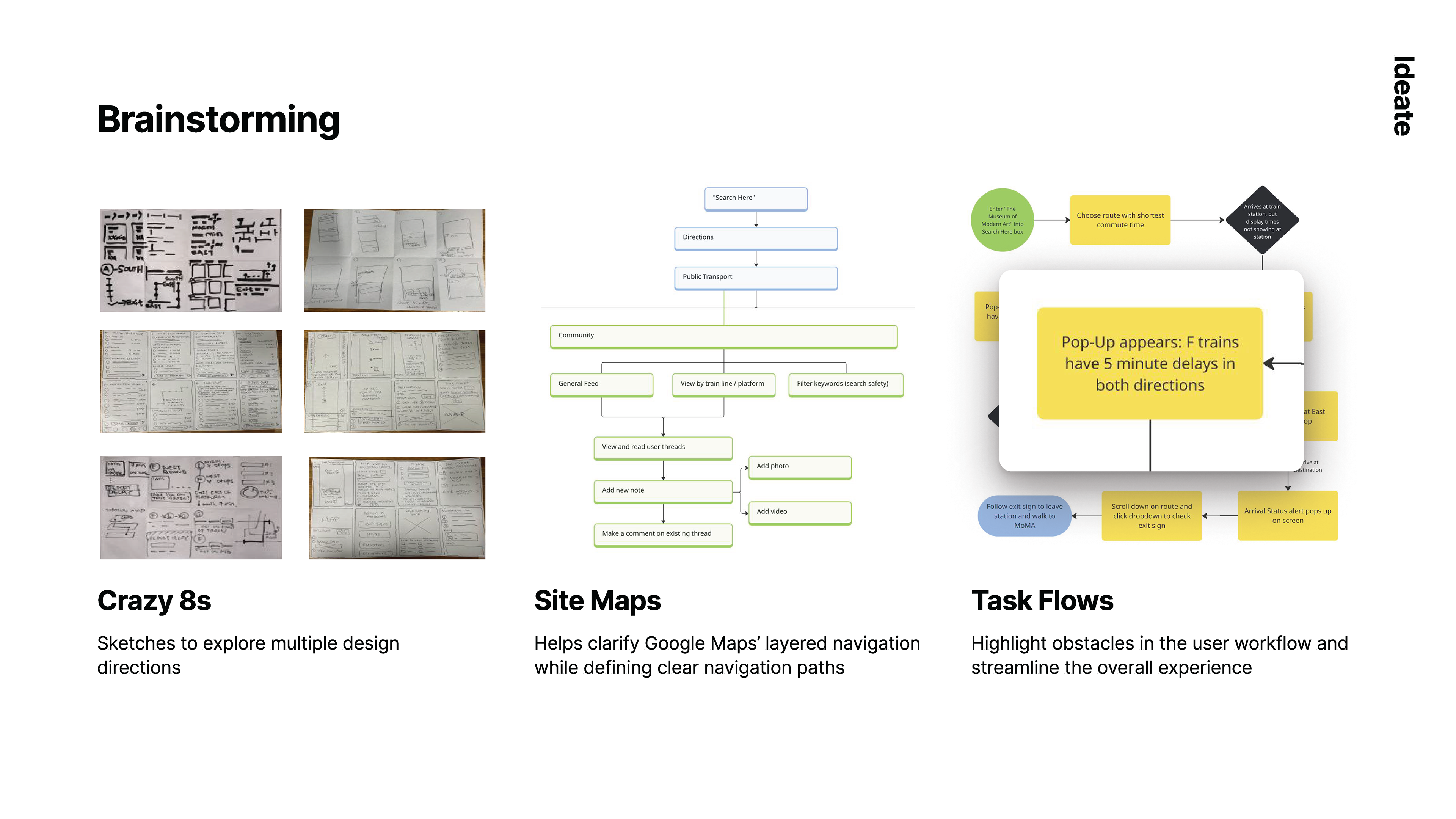
We ideated and explored multiple directions through:
Crazy 8s sketching
Site maps to understand Google Maps’ layered navigation
Task flows to identify breakdown points in the journey
We worked within a hybrid design system, combining Google Maps UI patterns with custom components to ensure realism and feasibility.

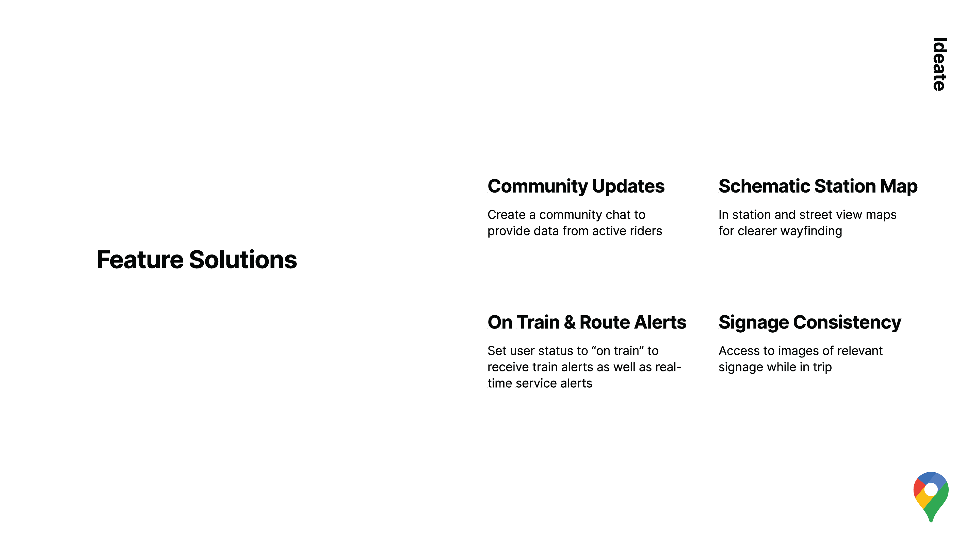
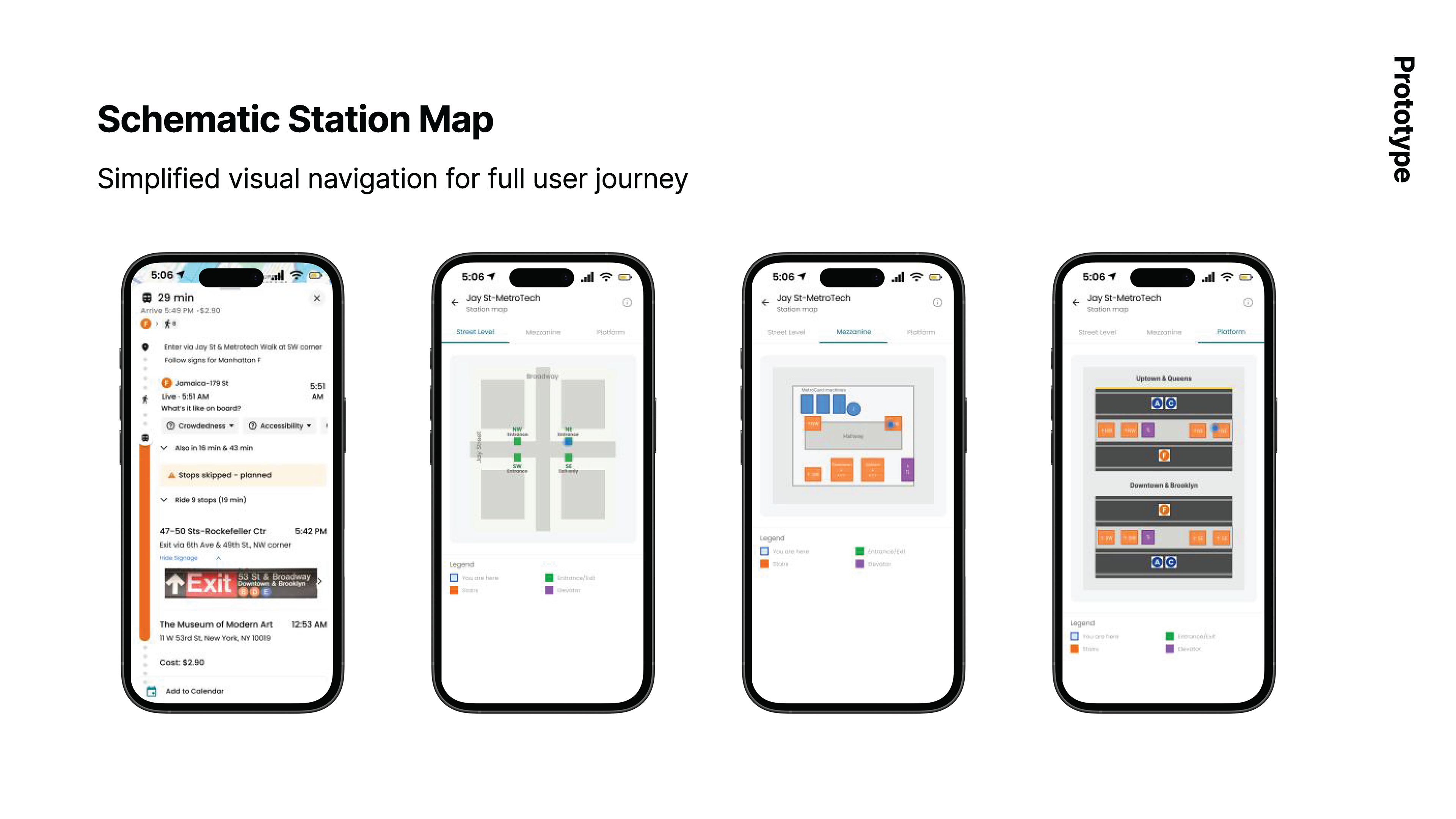
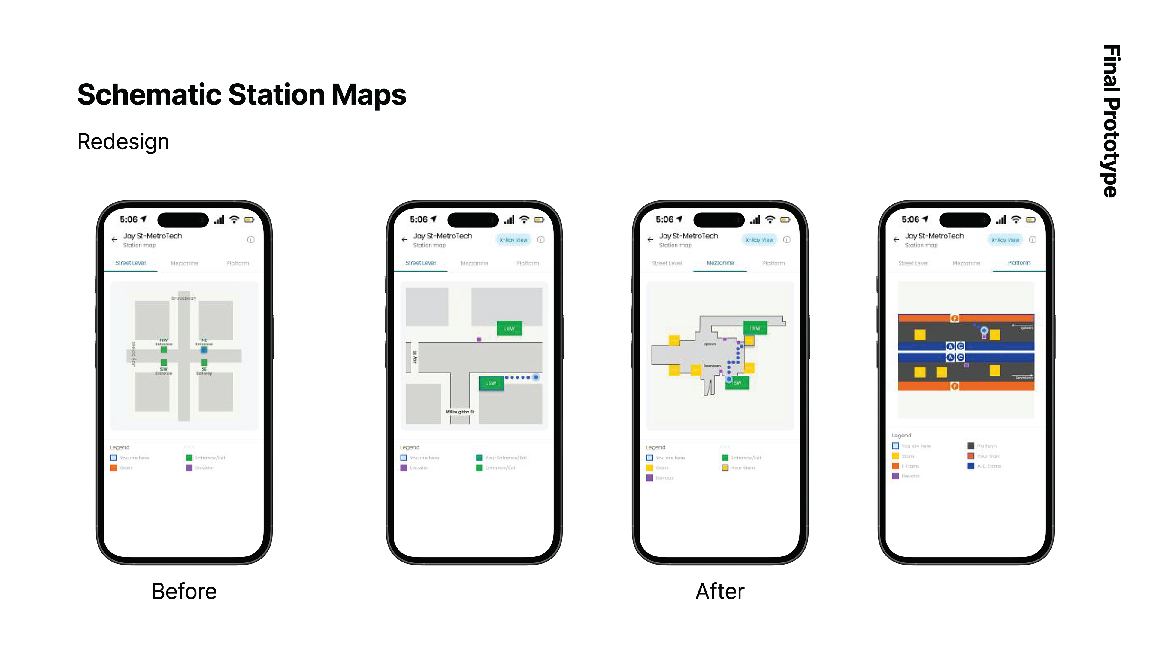
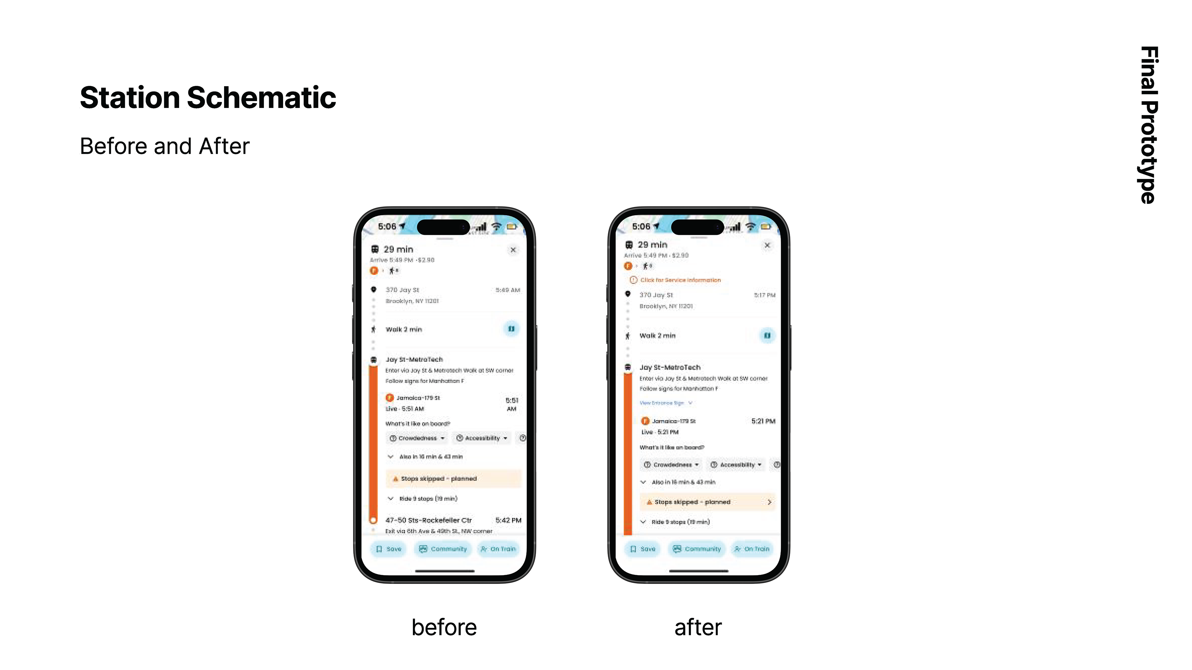
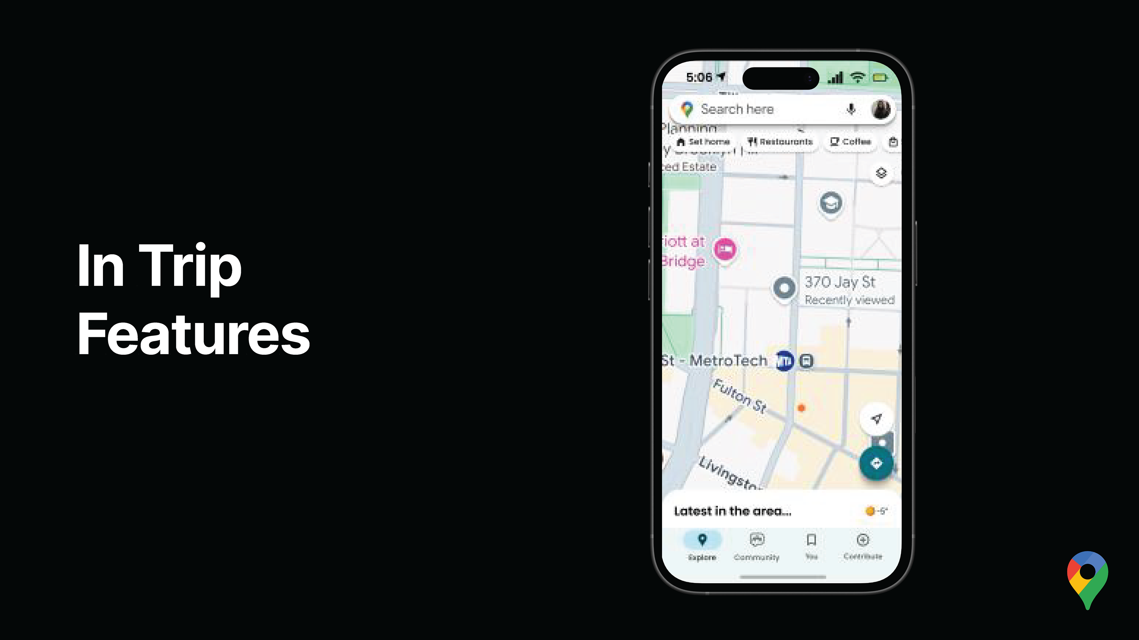
1. Schematic Station Maps
A simplified, level-based station view (street → mezzanine → platform) that visualizes exits, transfers, and pathways clearly—reducing orientation breakdowns. Adding images of real entrance and exit signage within route to increase clarity and credibility, and reduce confusion.
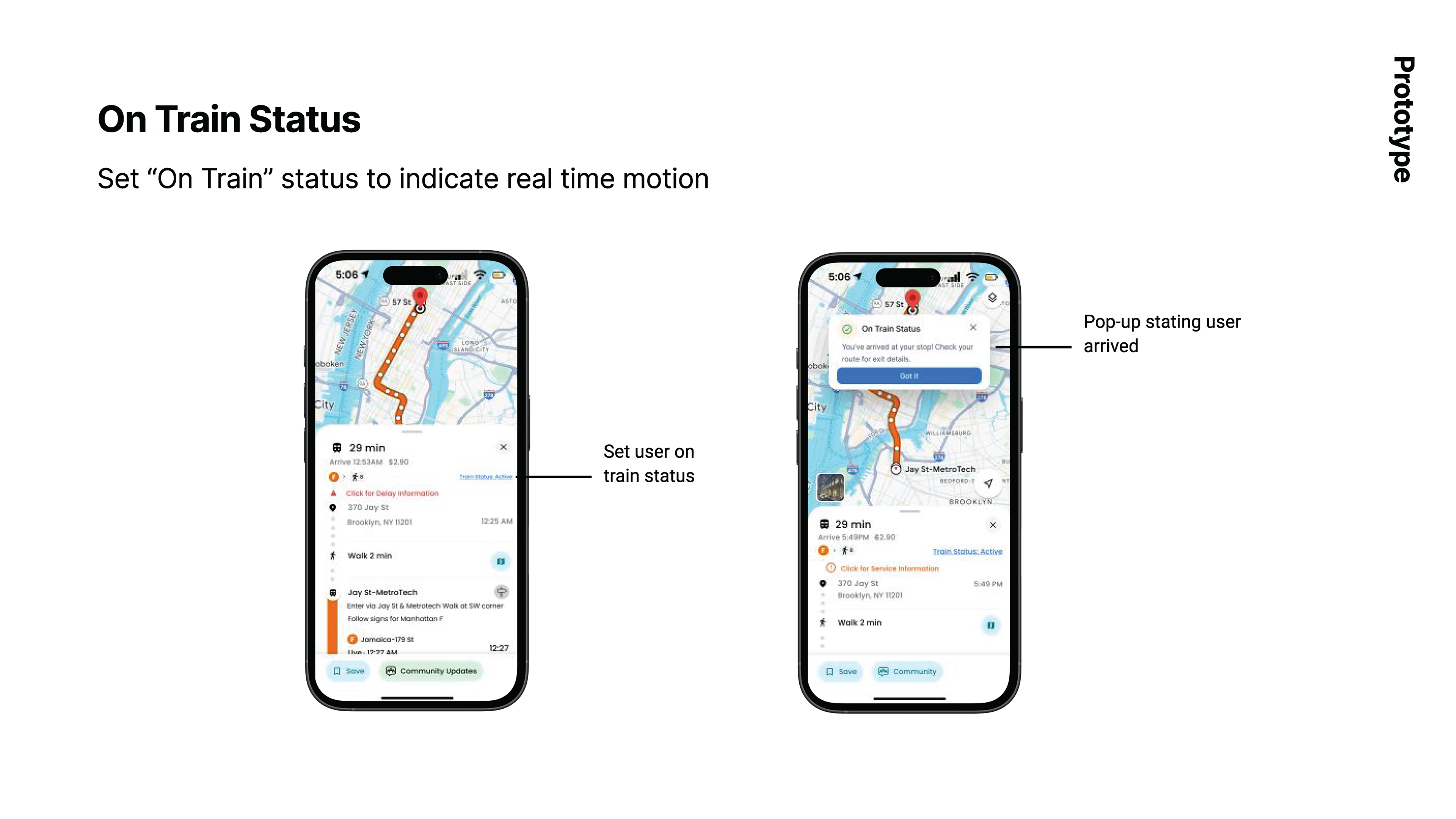
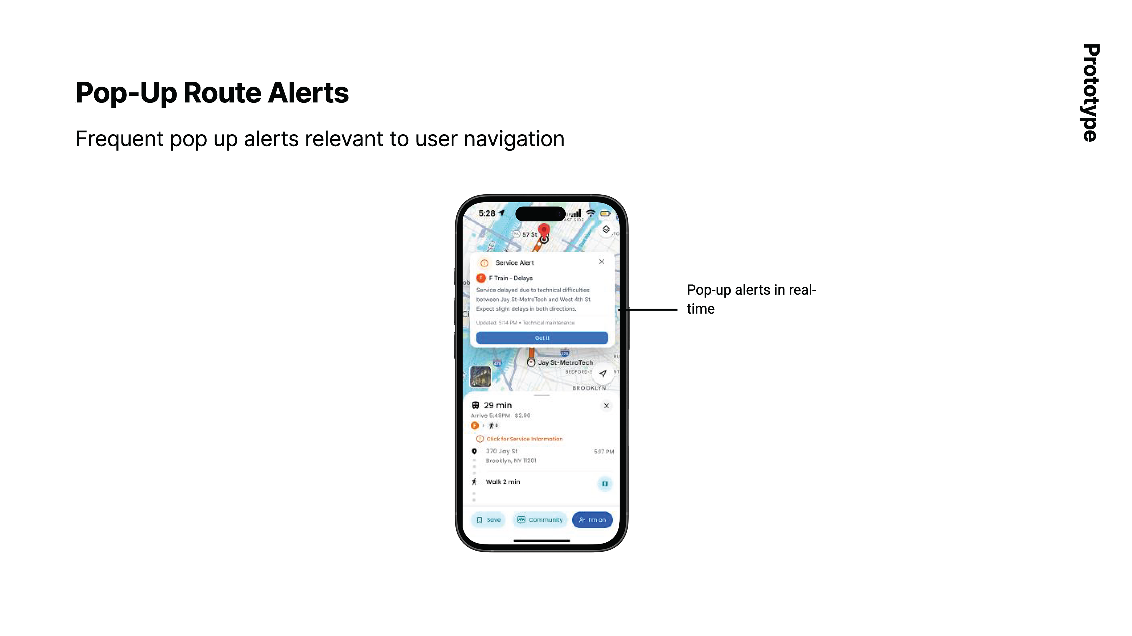
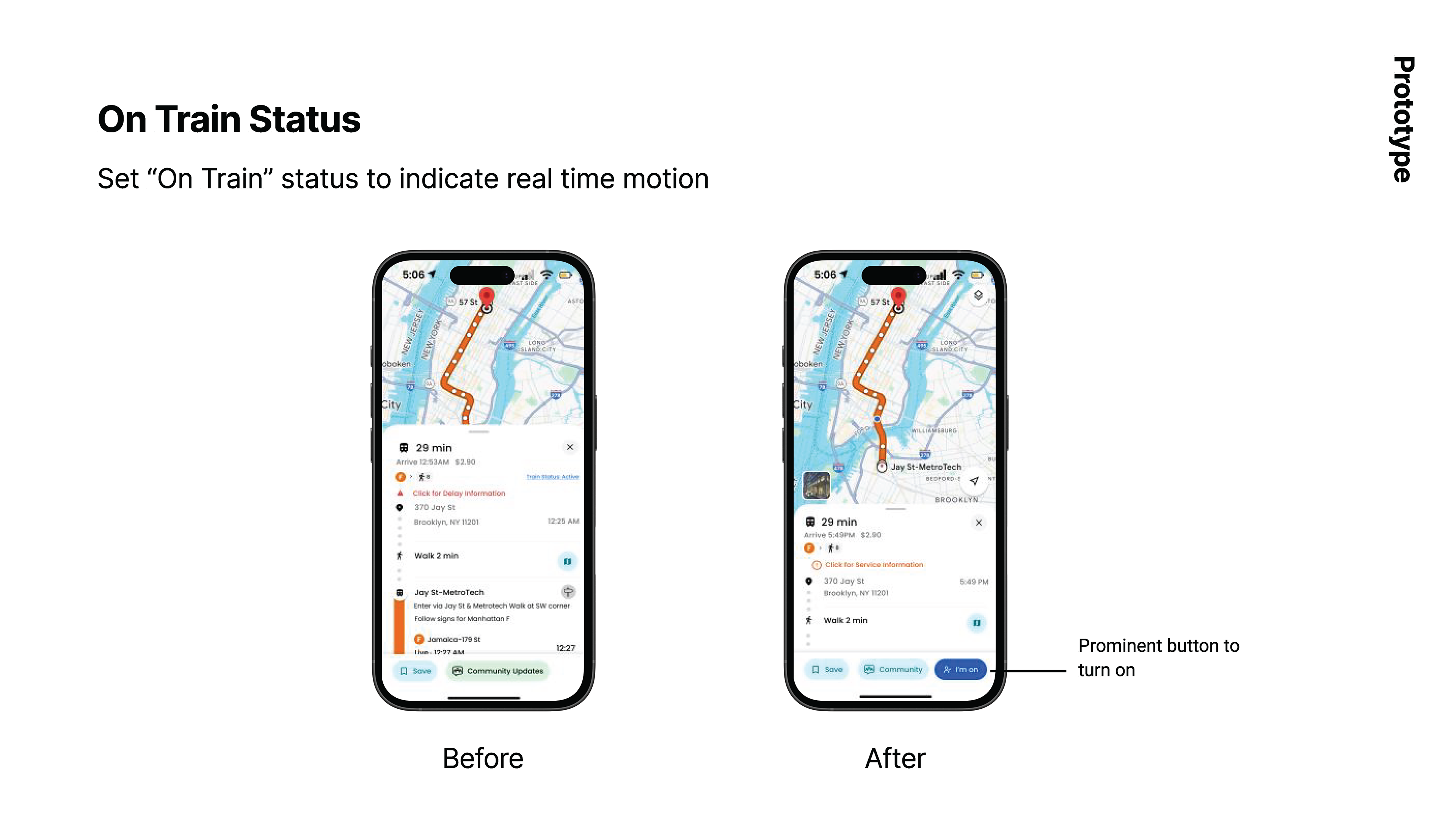
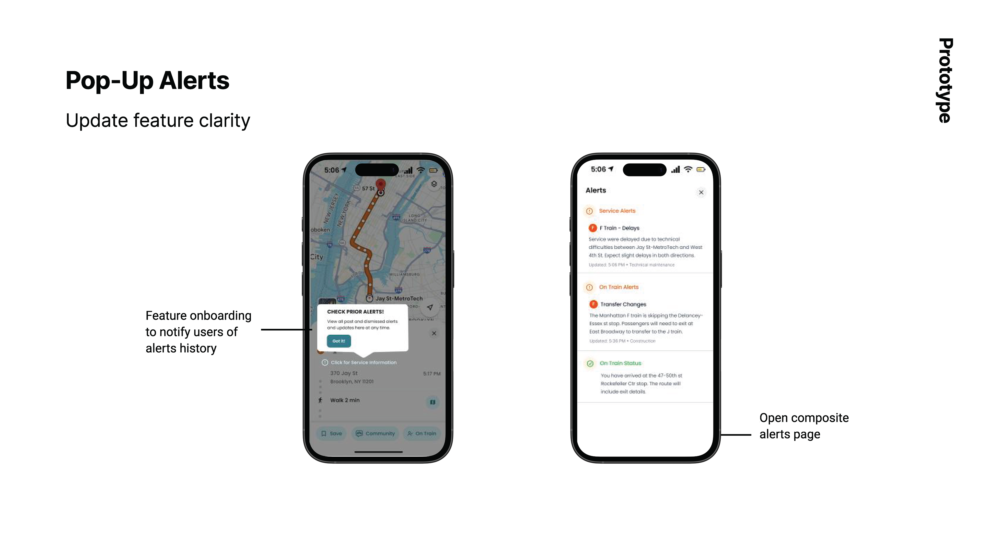
2. On-Train Status & Route Alerts
Riders can set an “On Train” status to receive proactive, real-time alerts during delays, arrivals, and reroutes—without interrupting their flow.
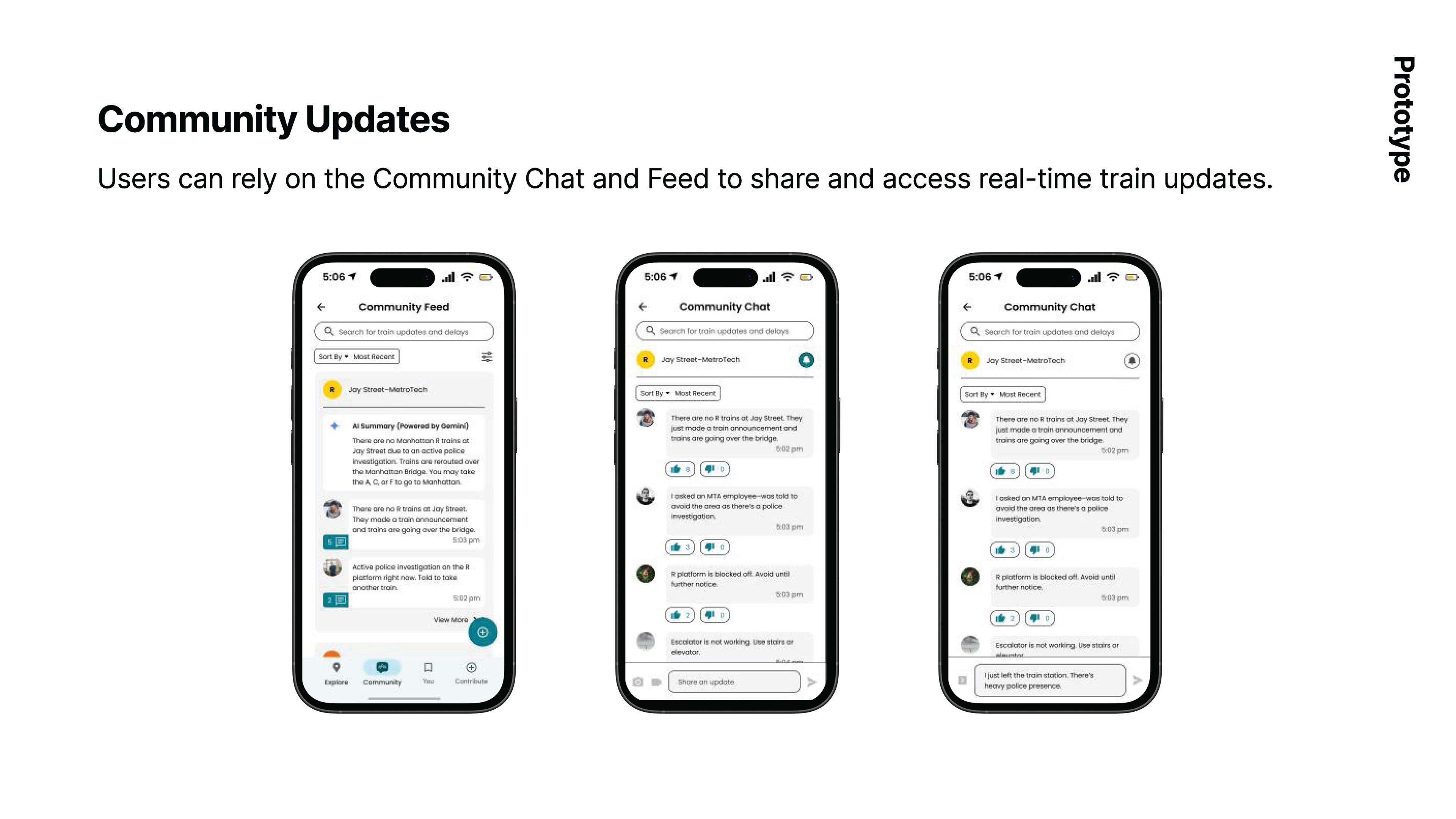
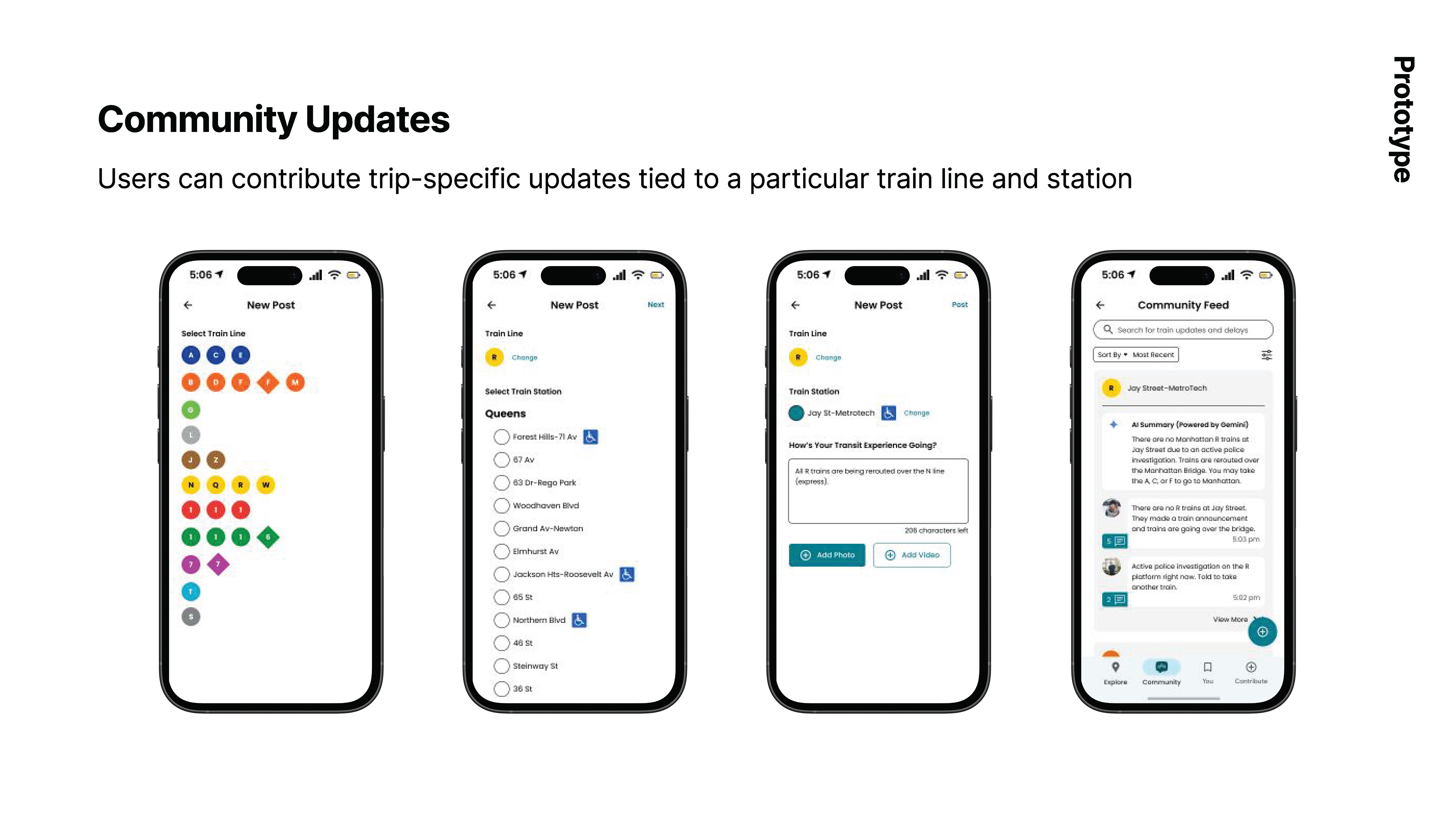
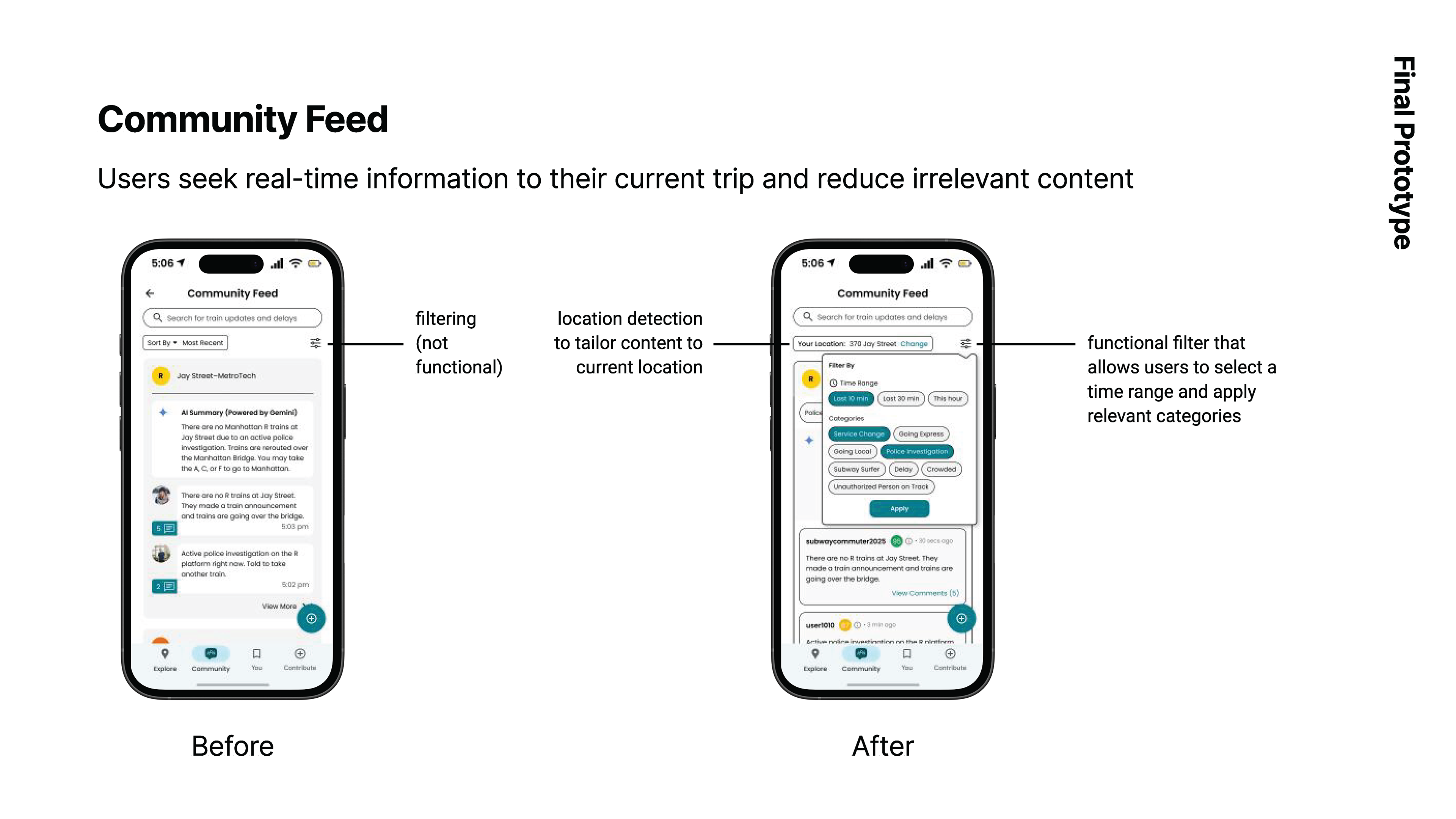
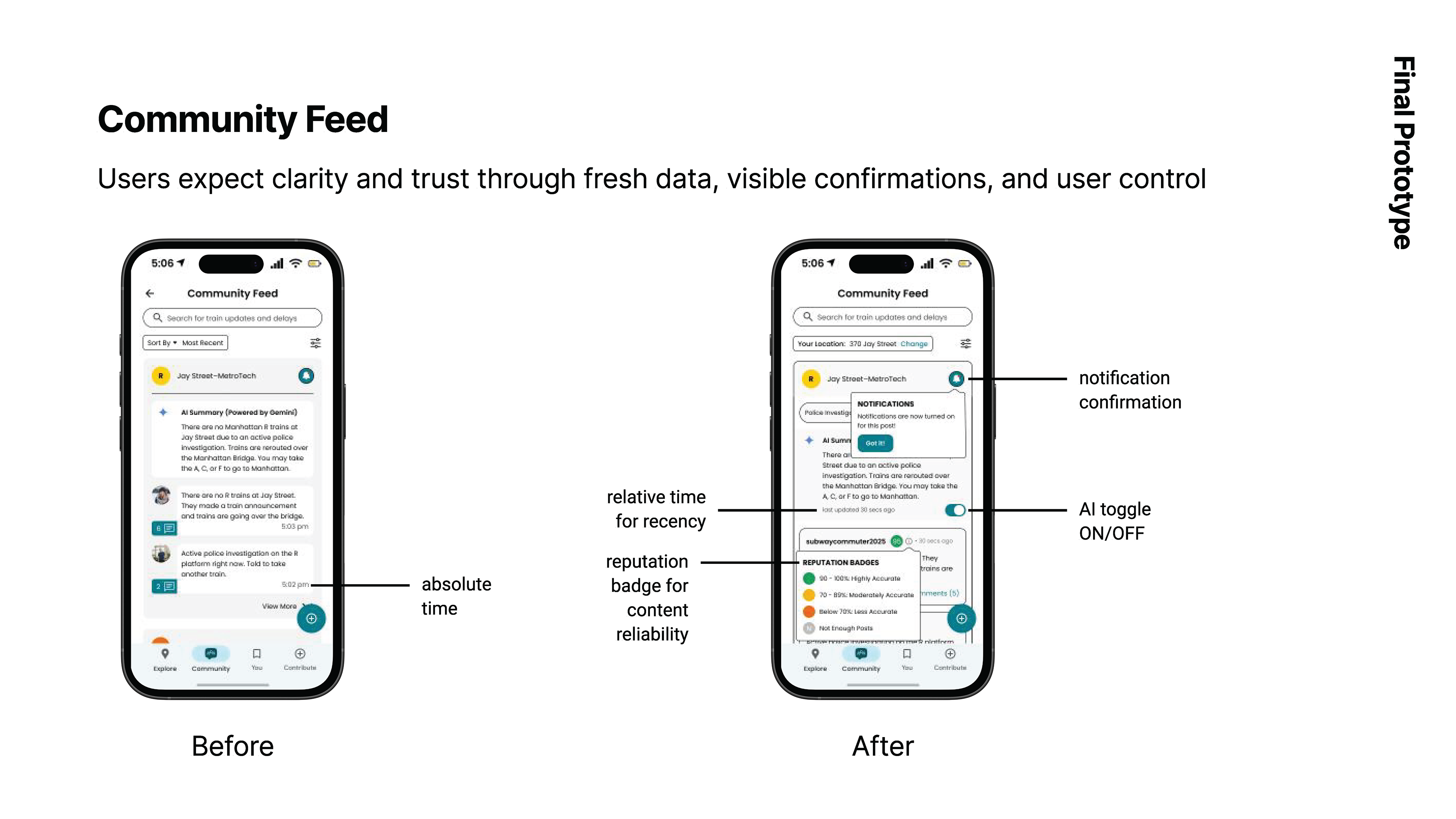
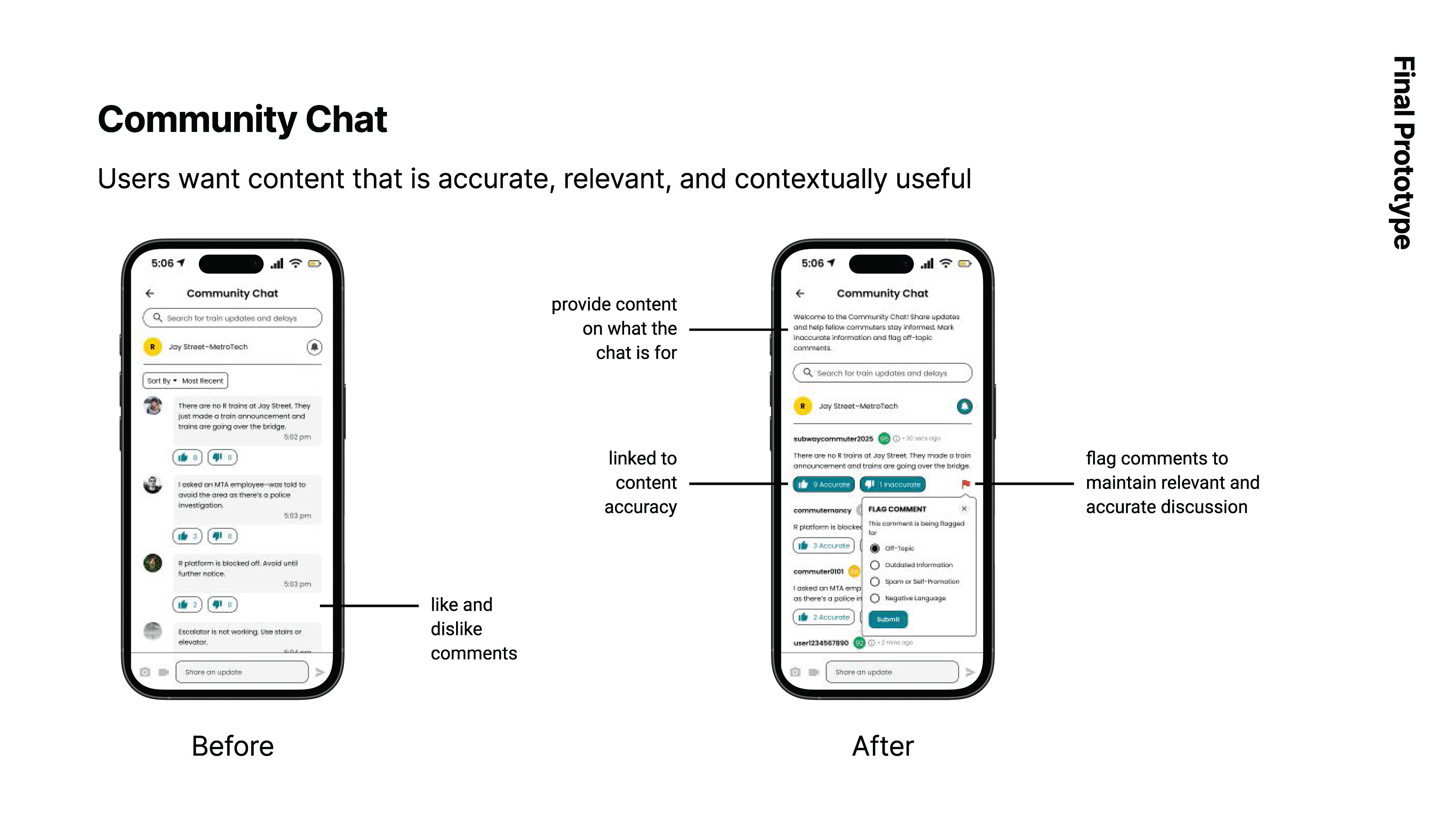
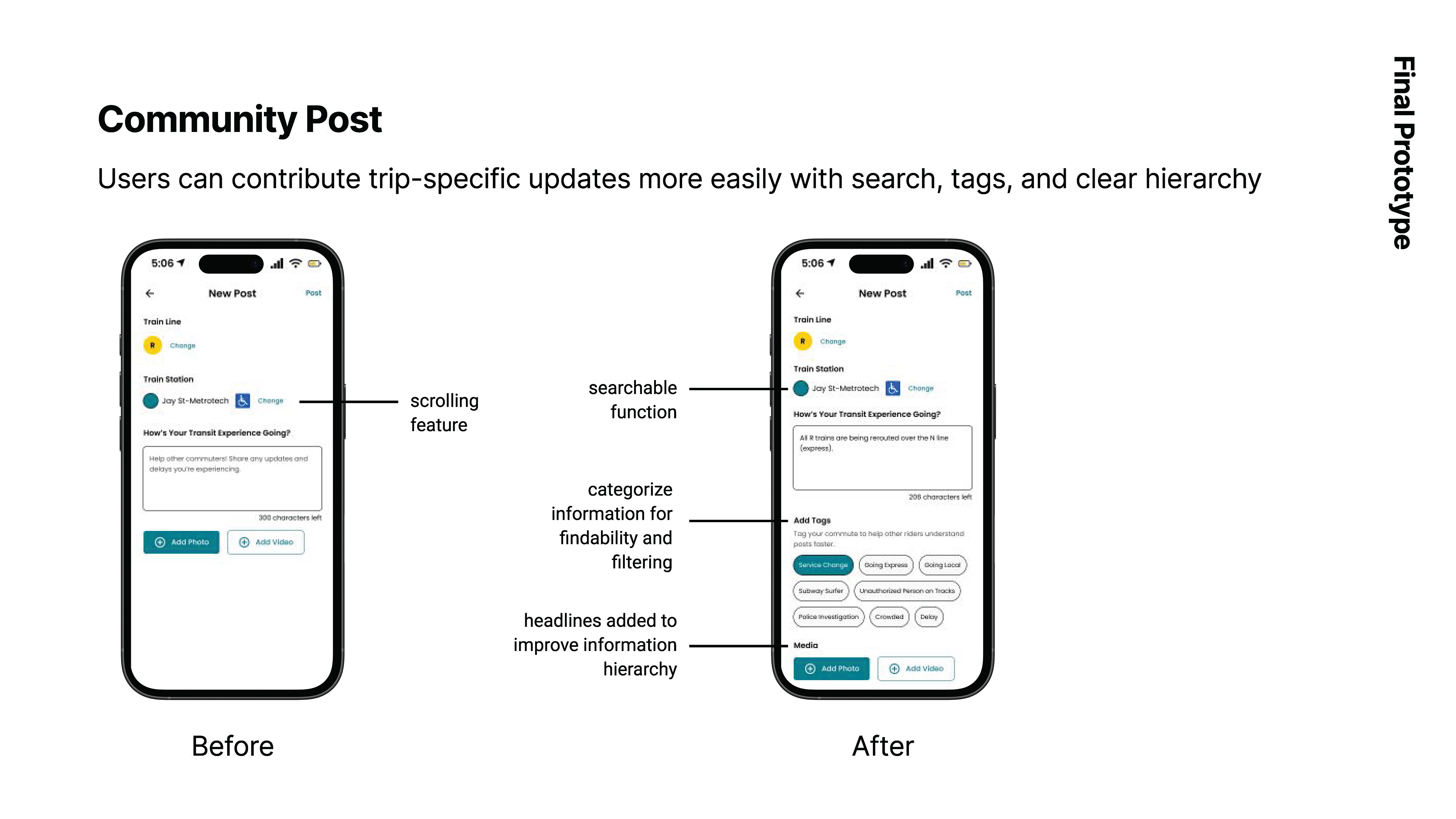
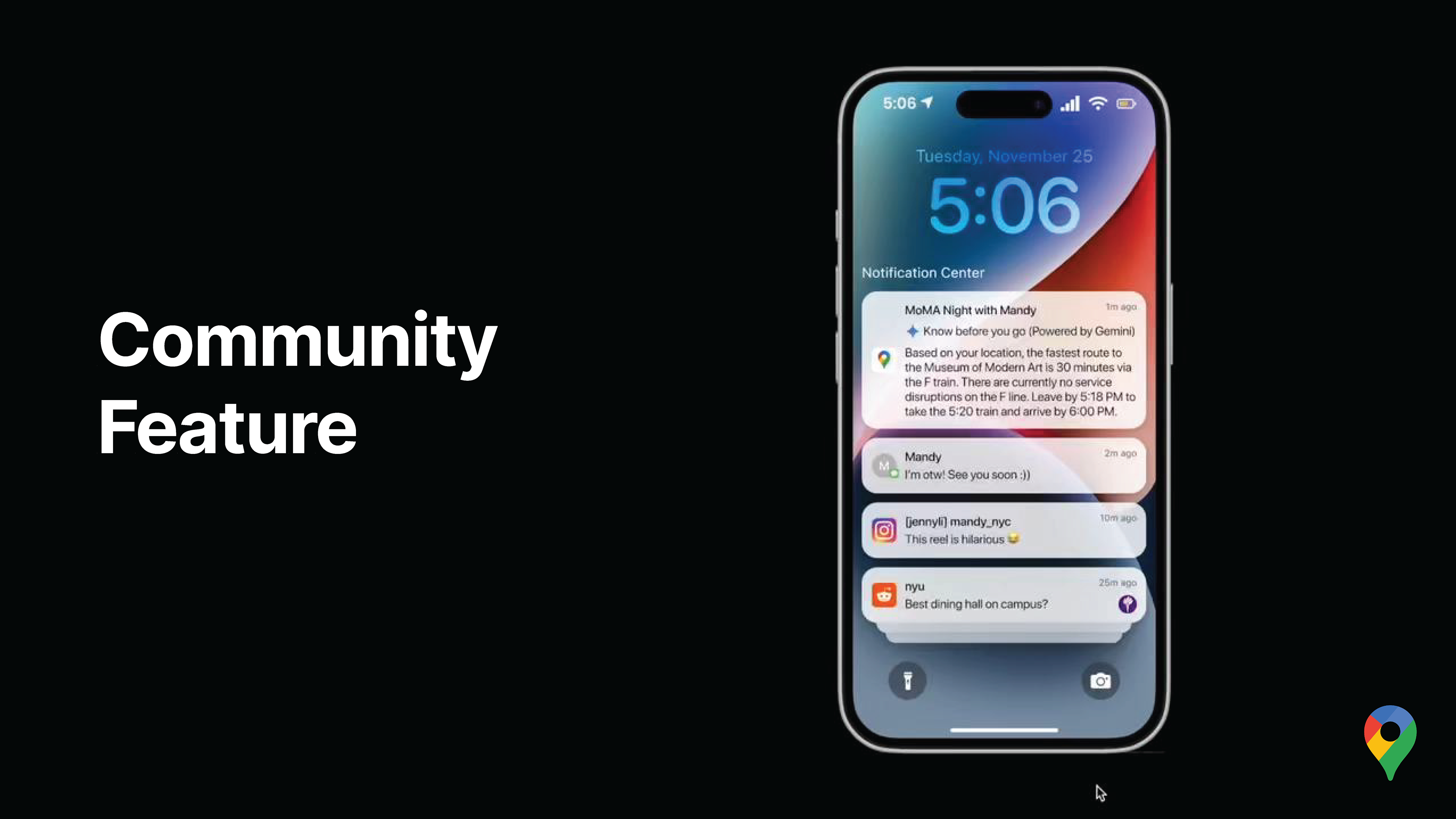
3. Community Updates (Chat + Feed)
A dedicated community space within Google Maps where riders can:
— Share trip-specific updates tied to lines and stations
— Filter by time, relevance, and location
— See reputation indicators for content reliability
— Toggle AI support on/off for transparency and trust
Testing & Iteration
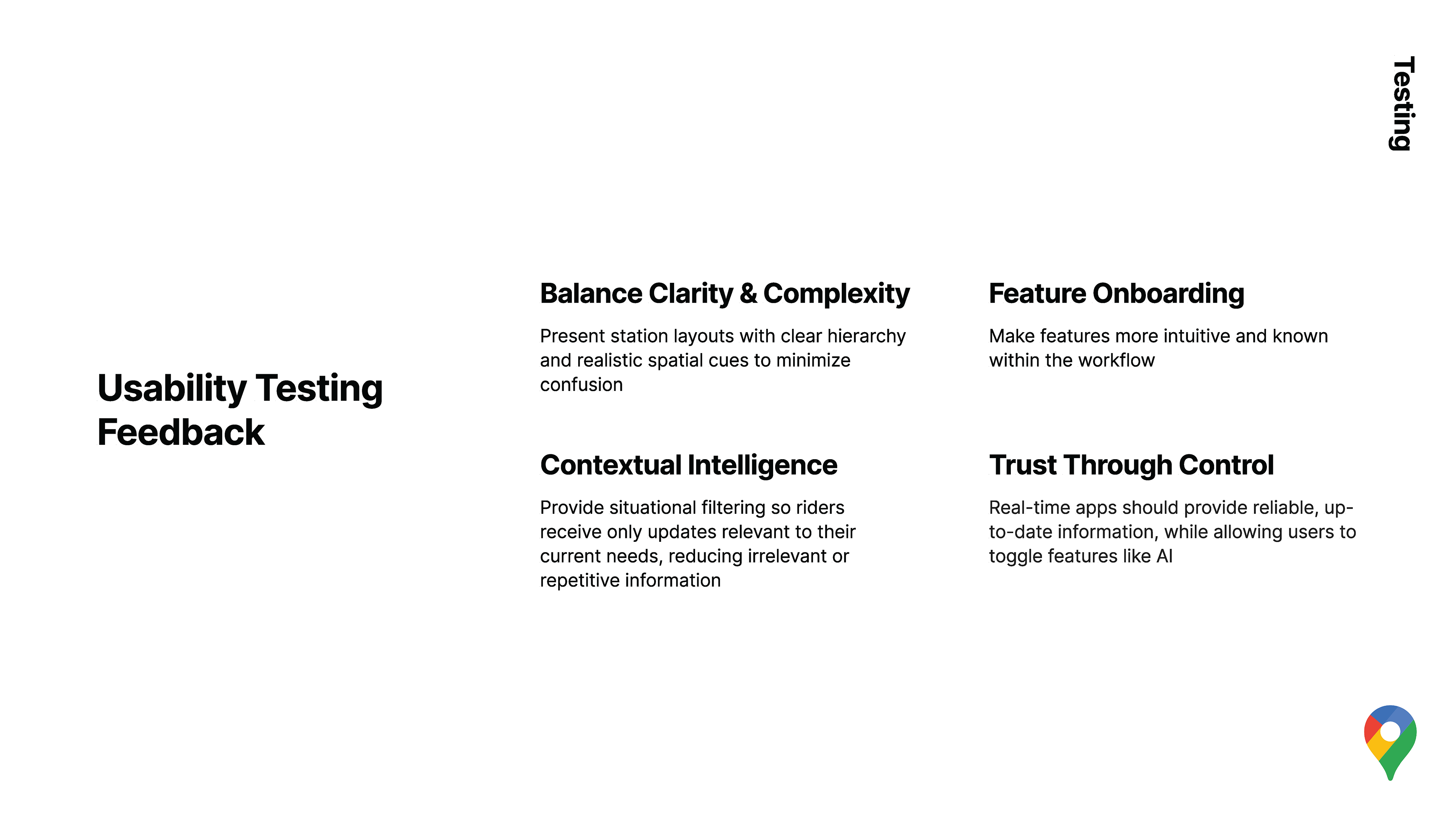
Usability testing revealed key refinements:
— Balance clarity with spatial realism in station maps
— Filter alerts to avoid information overload
— Make feature entry points more visible within the existing Google Maps flow
— Build trust through timestamps, confirmations, and user control
We iterated on station schematics, alert onboarding, and community filtering based on this feedback.
Given the scope of our project, there were many things that we hoped to be able to address. We included some initial next steps based on our research insights.
Inspired by feedback form our industry panel, we developed an additional future direction for the on-train feature.
Notable Future Direction: Reducing User Effort Through Intelligent Automation
Building on our research insights around cognitive load and in-motion decision-making, we also explored future directions focused on making the experience increasingly effort-free and anticipatory.
Predictive On-Train Detection:
Leverage geolocation signals, movement patterns, and user velocity to infer when a rider is on a train, reducing the need for manual status toggling.
Leverage geolocation signals, movement patterns, and user velocity to infer when a rider is on a train, reducing the need for manual status toggling.
Default-to-On Behaviour:
Shift the interaction model from an “On Train” activation to a “Not on Train” override, minimizing user effort during high-attention moments and aligning with real-world rider behaviour.
Shift the interaction model from an “On Train” activation to a “Not on Train” override, minimizing user effort during high-attention moments and aligning with real-world rider behaviour.
Progressive Automation with User Control:
Maintain transparency and trust by allowing users to override automated states, balancing convenience with agency.
Maintain transparency and trust by allowing users to override automated states, balancing convenience with agency.
Context-Aware Information Surfacing:
Use inferred travel state (walking, waiting, moving underground) to surface only the most relevant station-level navigation, alerts, and community updates.
Use inferred travel state (walking, waiting, moving underground) to surface only the most relevant station-level navigation, alerts, and community updates.
These directions aim to further reduce friction, cognitive load, and interaction cost—especially during moments when riders are already navigating complex physical environments.
Full disclosure, while this is a real quote, the interviewee here is my roommate, and so I am not very sure if he had a choice to go on the record for this comment. Alas, thank you, Liam, for your positive feedback.
Proposed Performance Indicators
To evaluate the effectiveness of the proposed features, the following performance indicators could be used to measure improvements in wayfinding clarity, rider confidence, and real-time decision-making:
Wayfinding & Navigation Effectiveness
— Time to Correct Exit: Average time it takes riders to reach the intended station exit after arrival
— Wrong-Turn Rate: Frequency of backtracking or incorrect level transitions within stations
— Transfer Completion Confidence: Self-reported confidence scores during station transfers
Cognitive Load & User Experience
— Navigation Anxiety Index: Pre- and post-trip survey ratings measuring stress or uncertainty while navigating
— Interaction Efficiency: Number of taps or interactions required to access relevant station-level information
— Information Relevance Score: Percentage of surfaced information that riders report as useful to their current context
Real-Time Awareness & Trust
— Alert Engagement Rate: Open and interaction rates for on-train and route alerts
— Timeliness Perception: Rider perception of whether alerts arrived early enough to influence decisions
— Trust in Information: User-reported trust levels in app-provided updates compared to external sources
Community Feature Effectiveness
— Community Contribution Rate: Percentage of riders who view vs. contribute updates
— Update Freshness: Average age of community posts viewed during active trips
— Content Reliability Signals: Engagement with reputation indicators (likes, flags, confirmations)
Adoption & Retention
— Feature Discovery Rate: Percentage of users who discover and activate in-station navigation or on-train mode
— Repeat Usage: Frequency of feature use across multiple trips or stations
— Return-to-Google Maps Behavior: Reduction in app-switching to external platforms (e.g., Reddit, Twitter) during disruptions
My Contributions
I contributed across research, synthesis, user testing, interaction design, and evaluation planning, with a particular focus on in-station navigation systems, contextual wayfinding, and measuring UX impact.
Research, Testing & Synthesis
— Co-designed the screener survey and participant segmentation criteria (new vs. experienced MTA riders)
— Authored and conducted semi-structured user interviews and usability testing sessions
— Led the end-to-end synthesis of user testing data, including affinity mapping, clustering insights, and prioritizing findings using an effort–impact framework
— Collected journey data and emotional feedback through contextual observation of rider behaviour
— Translated qualitative insights into behavioural patterns, experience maps, and actionable design principles
Interaction Design & Wayfinding Systems
— Led the design of the intra-station schematic map system, addressing navigation breakdowns between street, mezzanine, and platform levels
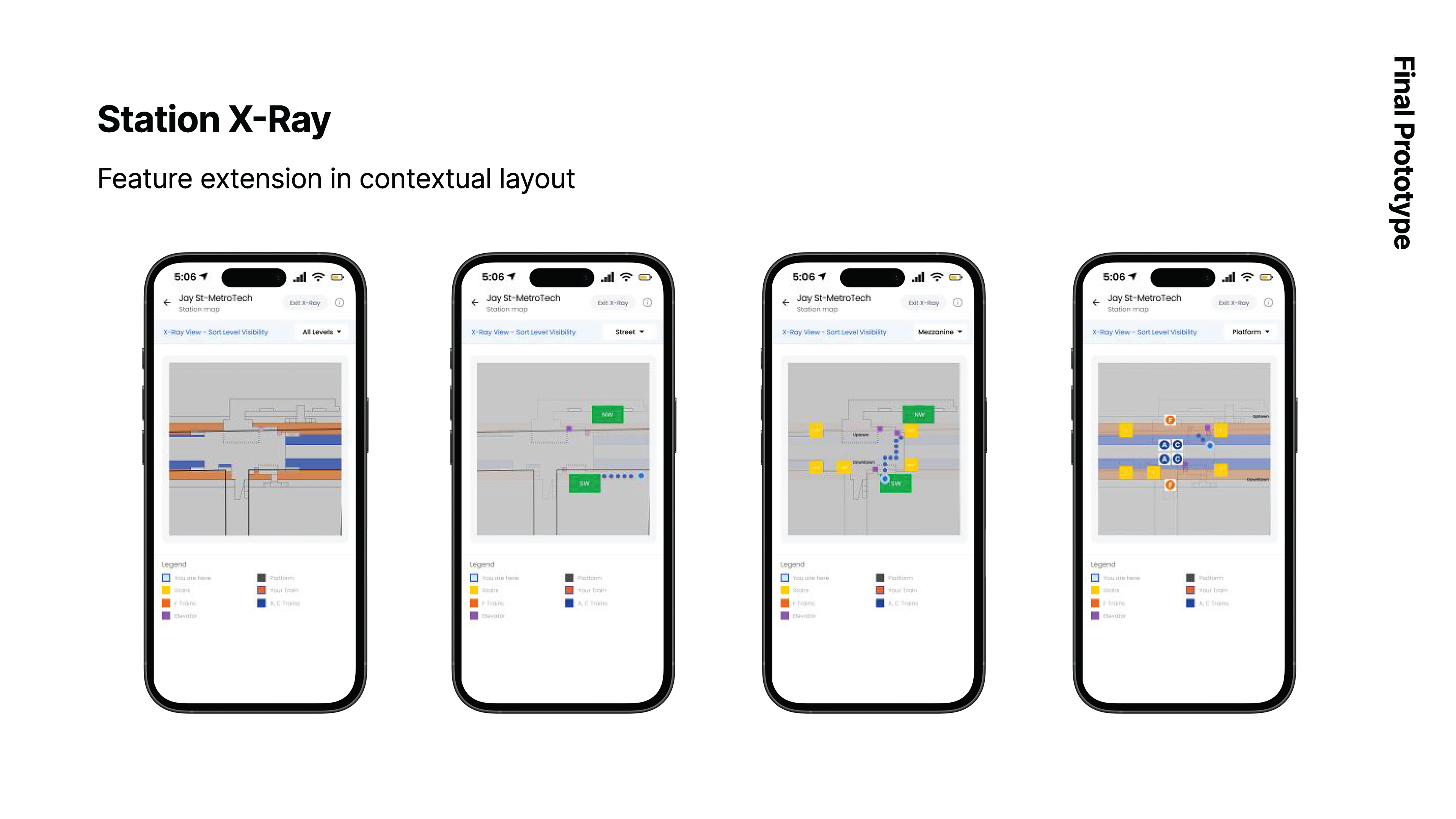
— Designed the Station X-Ray feature, introducing a layered, contextual view that reveals station complexity without overwhelming users
— Developed exit signage and station-level navigation features that align digital guidance with physical signage to reduce disorientation
— Focused on balancing clarity and complexity, ensuring spatial information remained legible, glanceable, and cognitively manageable
— Integrated contextual intelligence, surfacing station-level navigation and information only when relevant to a rider’s location and phase of travel
Evaluation & Product Thinking
— Defined proposed performance indicators to evaluate wayfinding effectiveness, cognitive load reduction, trust in real-time information, and community feature engagement
— Aligned success metrics with core design goals, supporting future iteration and data-informed decision-making
Future Ideation & Exploration
Initiated ideation for AR-assisted and adaptive signage concepts, exploring how digital overlays could augment physical wayfinding in complex stations, as well as future directions focused on effort-free UX, including predictive on-train detection using geolocation and user velocity
Reflection
This project significantly deepened my understanding of UX research as a foundation for design decision-making, and reinforced how essential it is to ground interface solutions in real user behaviour, emotions, and constraints. Moving from qualitative research to synthesis—and then translating those insights into concrete design systems—challenged me to think holistically about usability, cognition, and context rather than isolated screens.
I gained hands-on experience conducting user interviews and usability testing, leading affinity mapping and prioritization, and balancing clarity with complexity when designing for high-stakes, real-world environments like public transit. Designing for riders in motion sharpened my sensitivity to cognitive load, timing, and information relevance—skills that I will carry into future UX work.
Equally meaningful was the opportunity to collaborate with a team of like-minded designers who share a passion for creating thoughtful, human-centered experiences. Working closely together allowed us to challenge assumptions, iterate more critically, and push each other to design not just for aesthetics, but for real impact. This project reaffirmed my belief that strong UX design emerges at the intersection of research, collaboration, and a genuine commitment to solving everyday problems through design.